CSS面试题
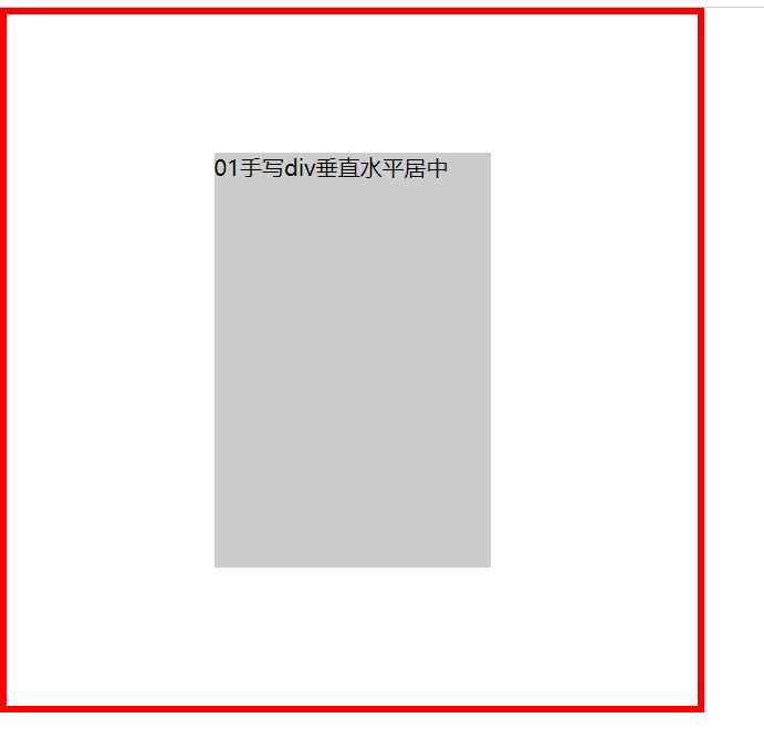
1.手写div垂直水平居中
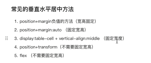
分两类:一类是固定宽高,一类不需要固定宽高
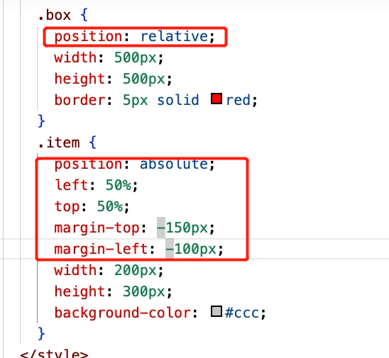
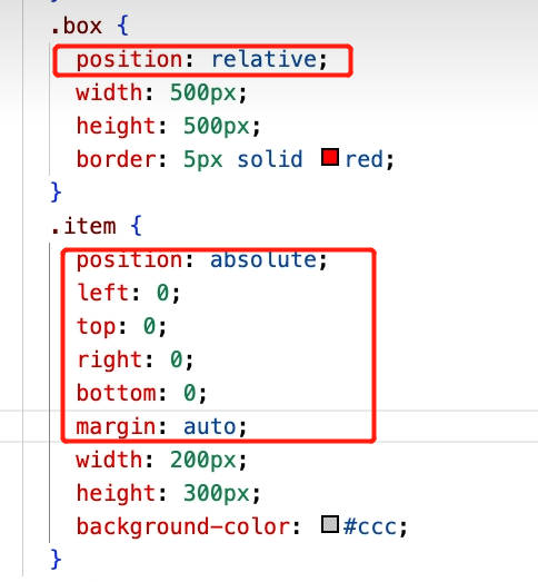
1.position+margin 负值
子元素必须有固定的宽高
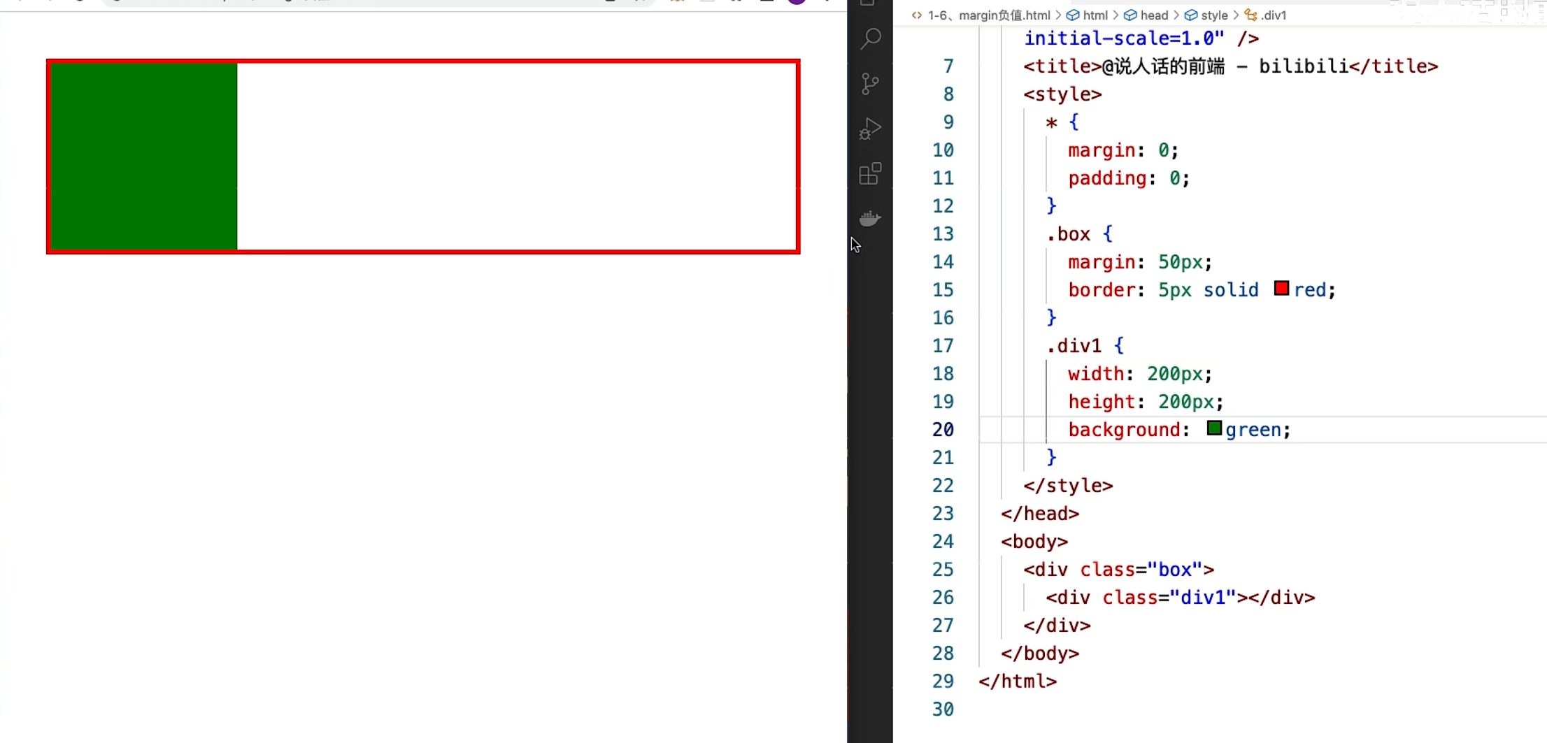
<!DOCTYPE html>
<html lang="en">
<head>
<meta charset="UTF-8">
<meta http-equiv="X-UA-Compatible" content="IE=edge">
<meta name="viewport" content="width=device-width, initial-scale=1.0">
<title>01手写div垂直水平居中</title>
</head>
<style>
*{
margin: 0;
padding: 0;
}
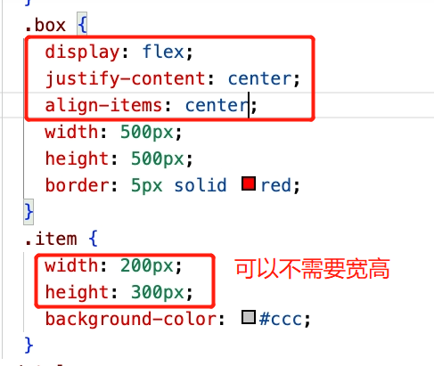
.box{
width: 500px;
height: 500px;
border: 5px solid red;
}
.item{
width: 200px;
height: 300px;
background-color: #ccc;
}
</style>
<body>
<div class="box">
<div class="item">01手写div垂直水平居中</div>
</div>
</body>
</html>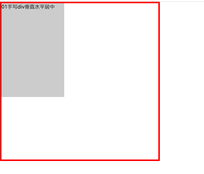
2.position+margin:atuo
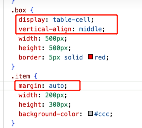
3.display:table-cell +vertical-align:middle+margin:auto
这种写法很少用,可以不用固定高度,但是width必须要有值
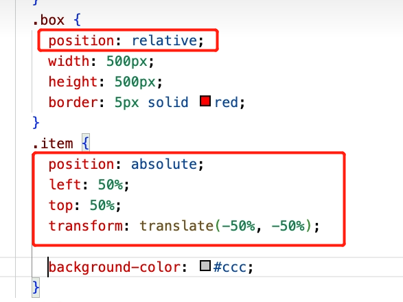
4.position+transform (不需要固定宽高)
5.flex(不需要宽高)
2.谈谈你对BFC的理解?
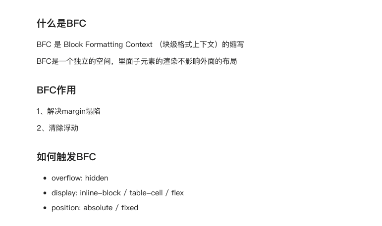
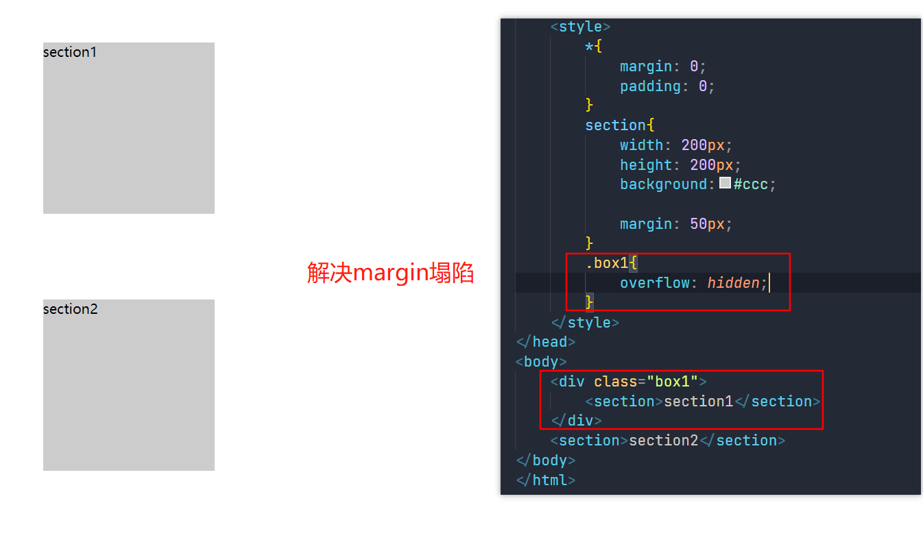
1.示例代码1(解决外边距重叠,下面描述有误,并不是margin塌陷):
<!DOCTYPE html>
<html lang="en">
<head>
    <meta charset="UTF-8">
    <meta http-equiv="X-UA-Compatible" content="IE=edge">
    <meta name="viewport" content="width=device-width, initial-scale=1.0">
    <title>Document</title>
    <style>
        *{
            margin: 0;
            padding: 0;
        }
        section{
            width: 200px;
            height: 200px;
            background:#ccc;
        }
    </style>
</head>
<body>
    <section>section1</section>
    <section>section2</section>
</body>
</html>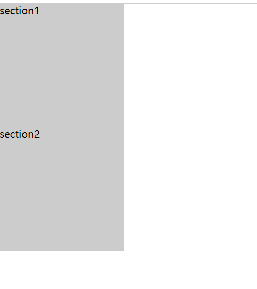
给section 添加一个 margin:50px后
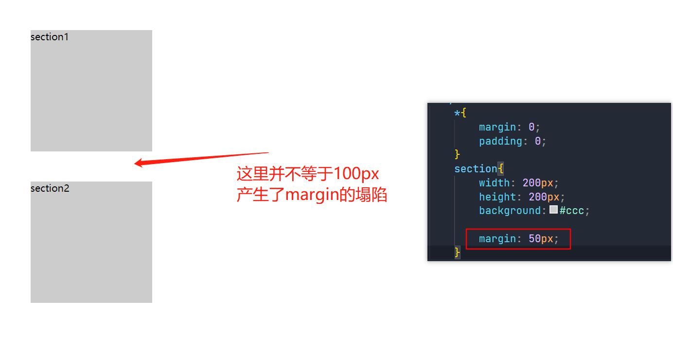
如何解决margin的塌陷?
2.示例代码2(清除浮动):
<!DOCTYPE html>
<html lang="en">
<head>
    <meta charset="UTF-8">
    <meta http-equiv="X-UA-Compatible" content="IE=edge">
    <meta name="viewport" content="width=device-width, initial-scale=1.0">
    <title>Document</title>
    <style>
        *{
            margin: 0;
            padding: 0;
        }
        section{
            width: 200px;
            height: 200px;
            background:#ccc;
            margin:20px;
        }
        .box{
            background-color: black;
        }
    </style>
</head>
<body>
    <div class="box">
    <section class="left">left</section>
    <section class="right">right</section>
</div>
</body>
</html>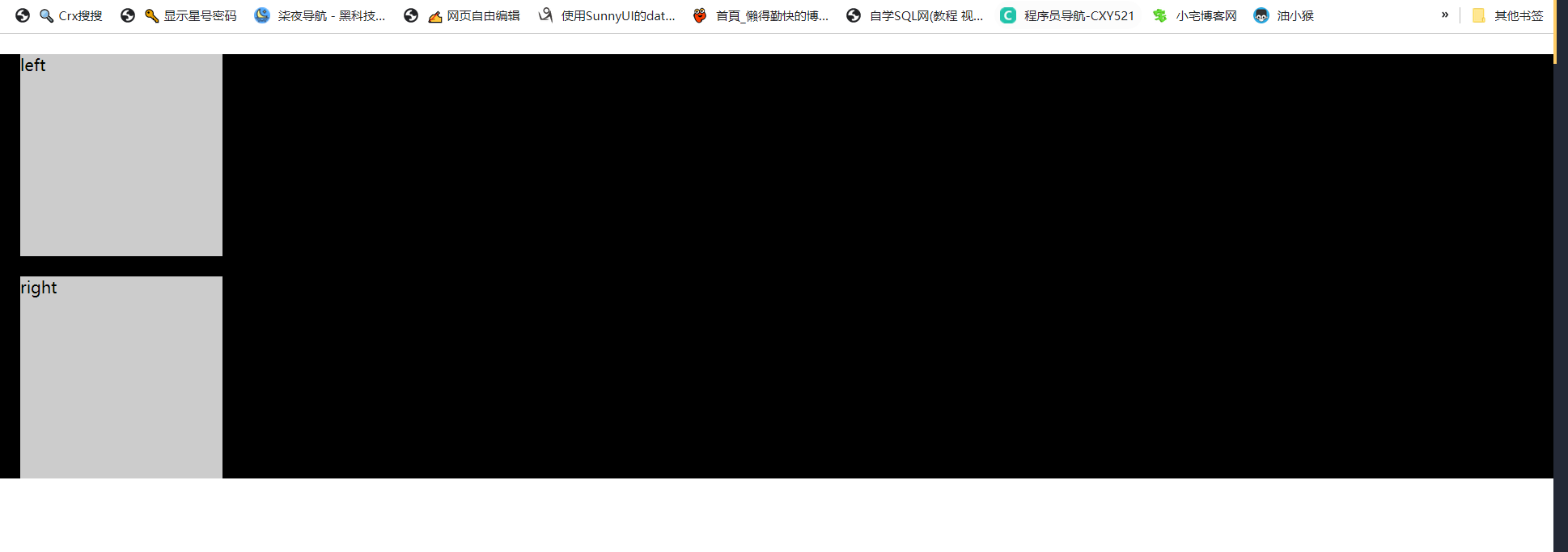
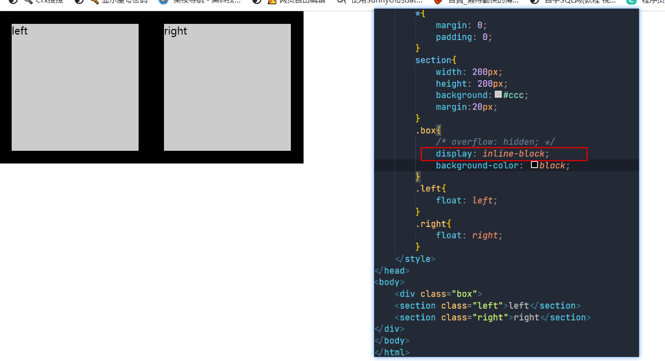
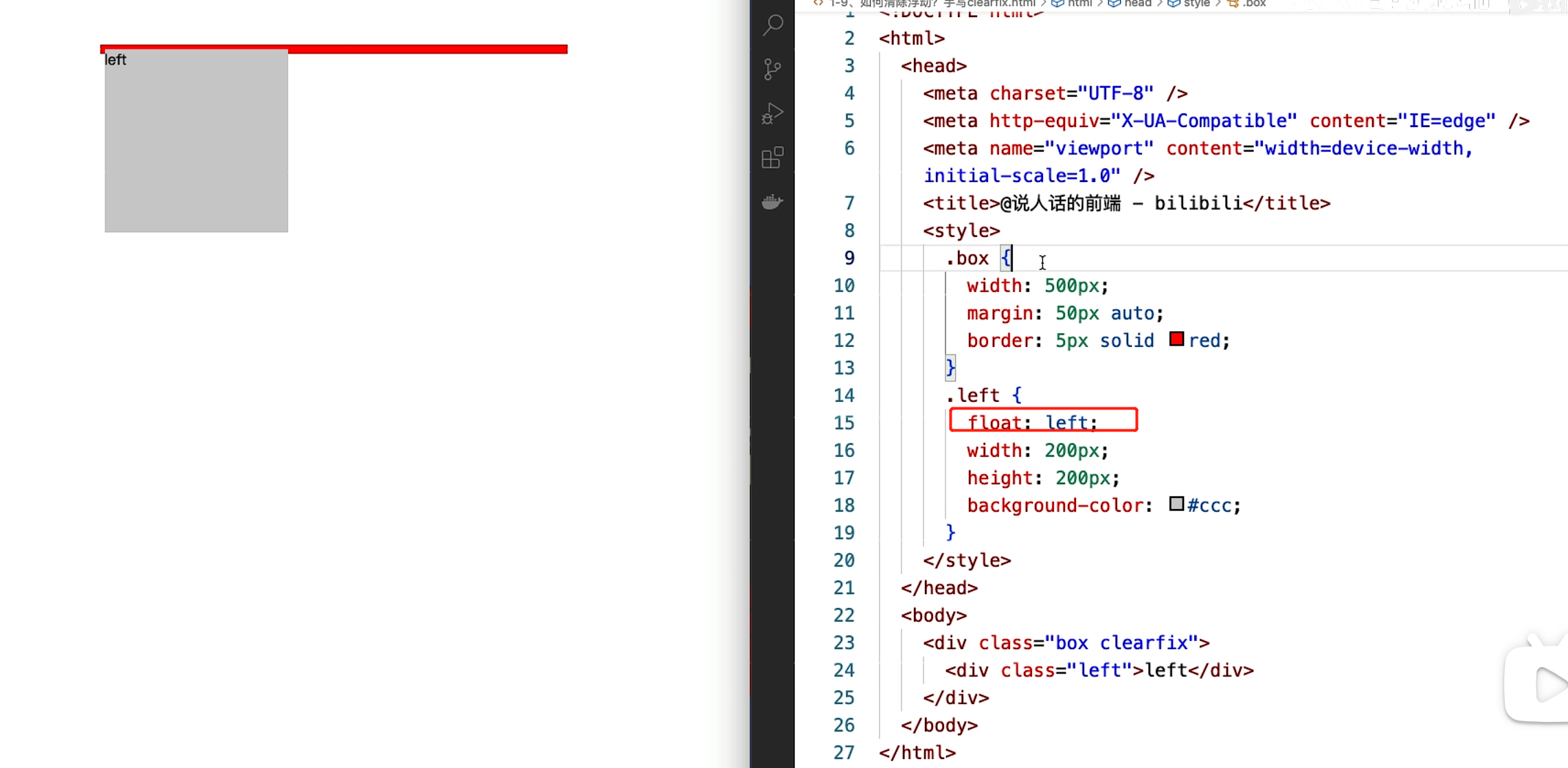
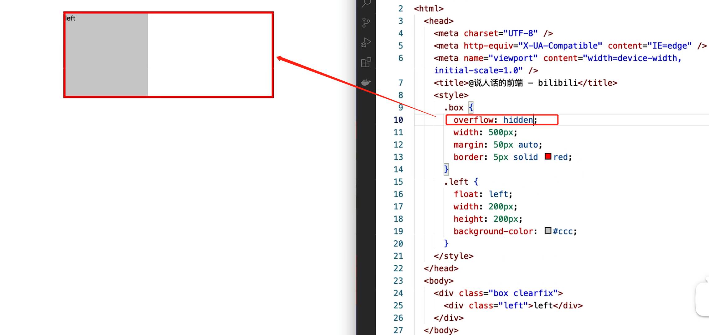
当给left进行左浮动,right 进行右浮动后
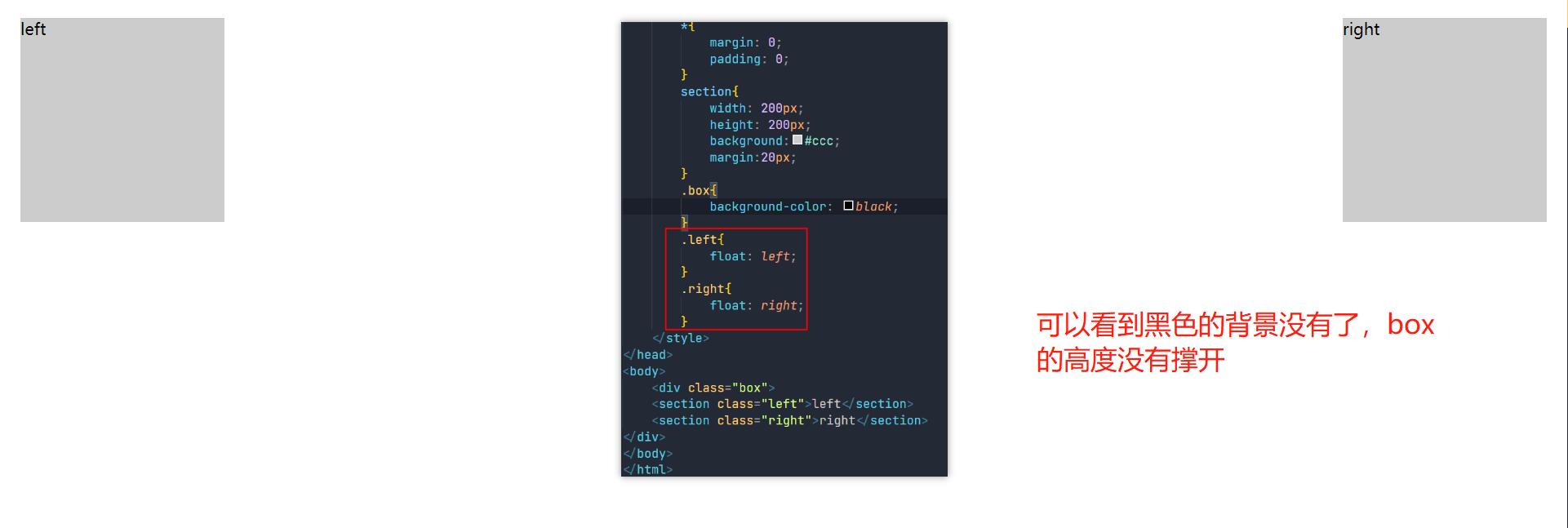
解决办法:
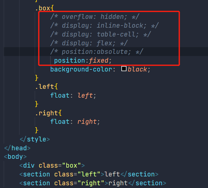
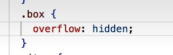
给box添加overflow:hidden; 或者display:inline-block;
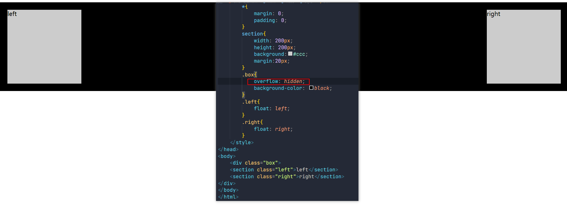
以下这些都可以清除浮动
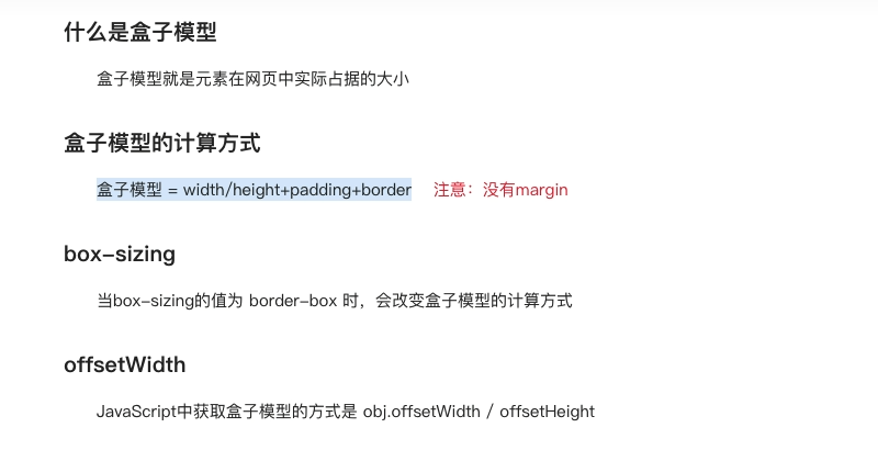
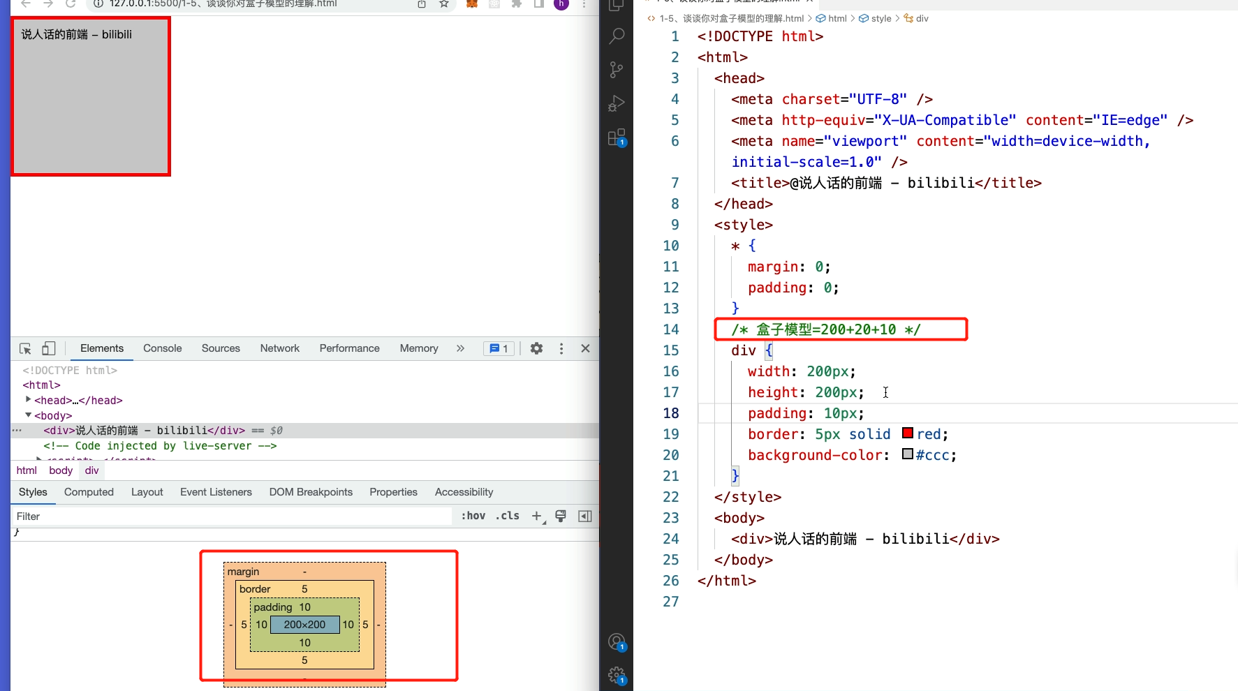
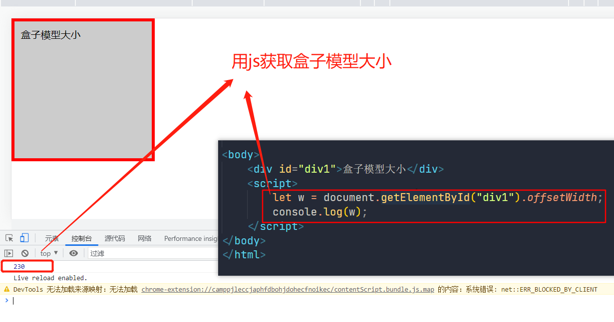
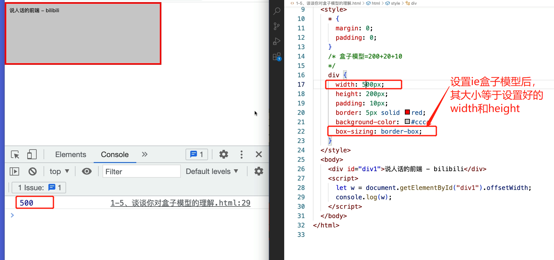
3.你对盒子模型理解多少?
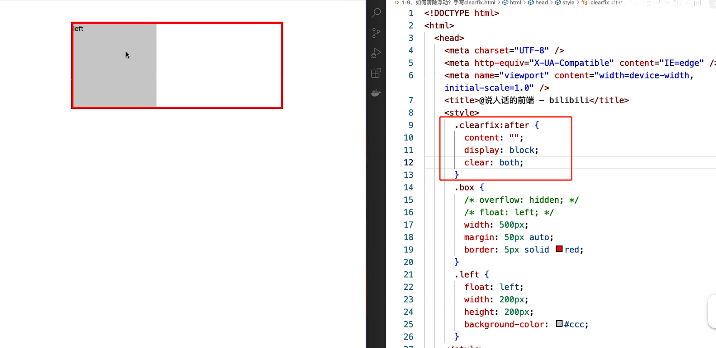
4.如何清除浮动?手写clearfix
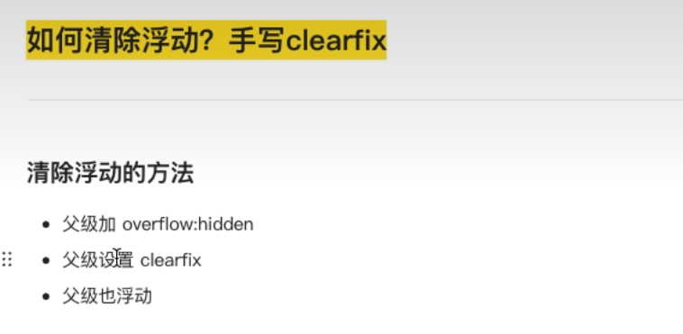
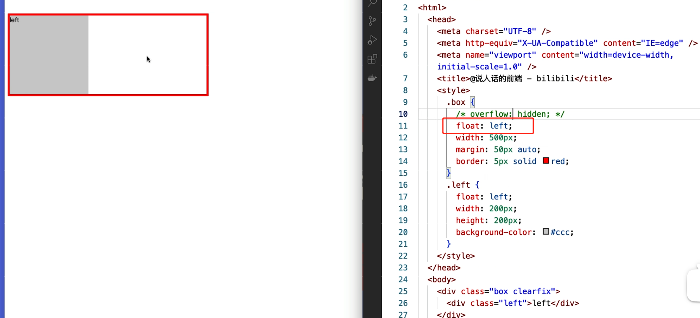
1.overflow:hidden
2. 让父级也进行浮动 float:left;
3. 写一个clearfix 的类 ,给父元素添加这个类
.clearfix:after{
    content:'';
    display:block;   // display:table;  table也行
    clear:both;
}
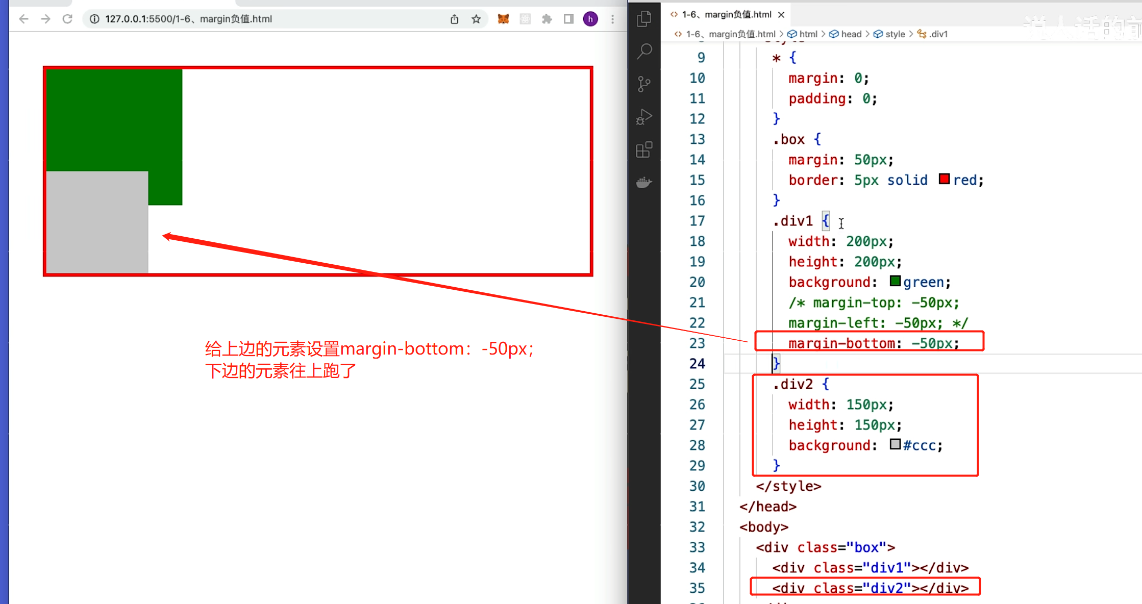
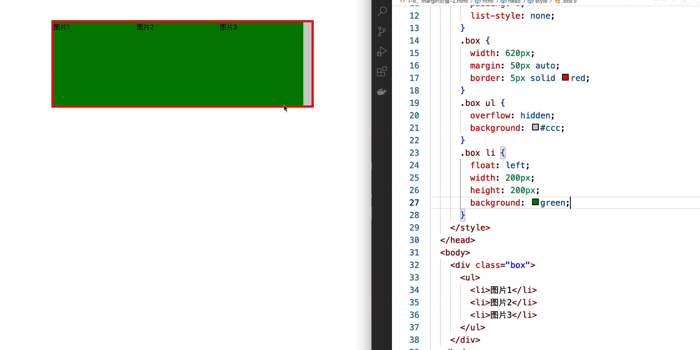
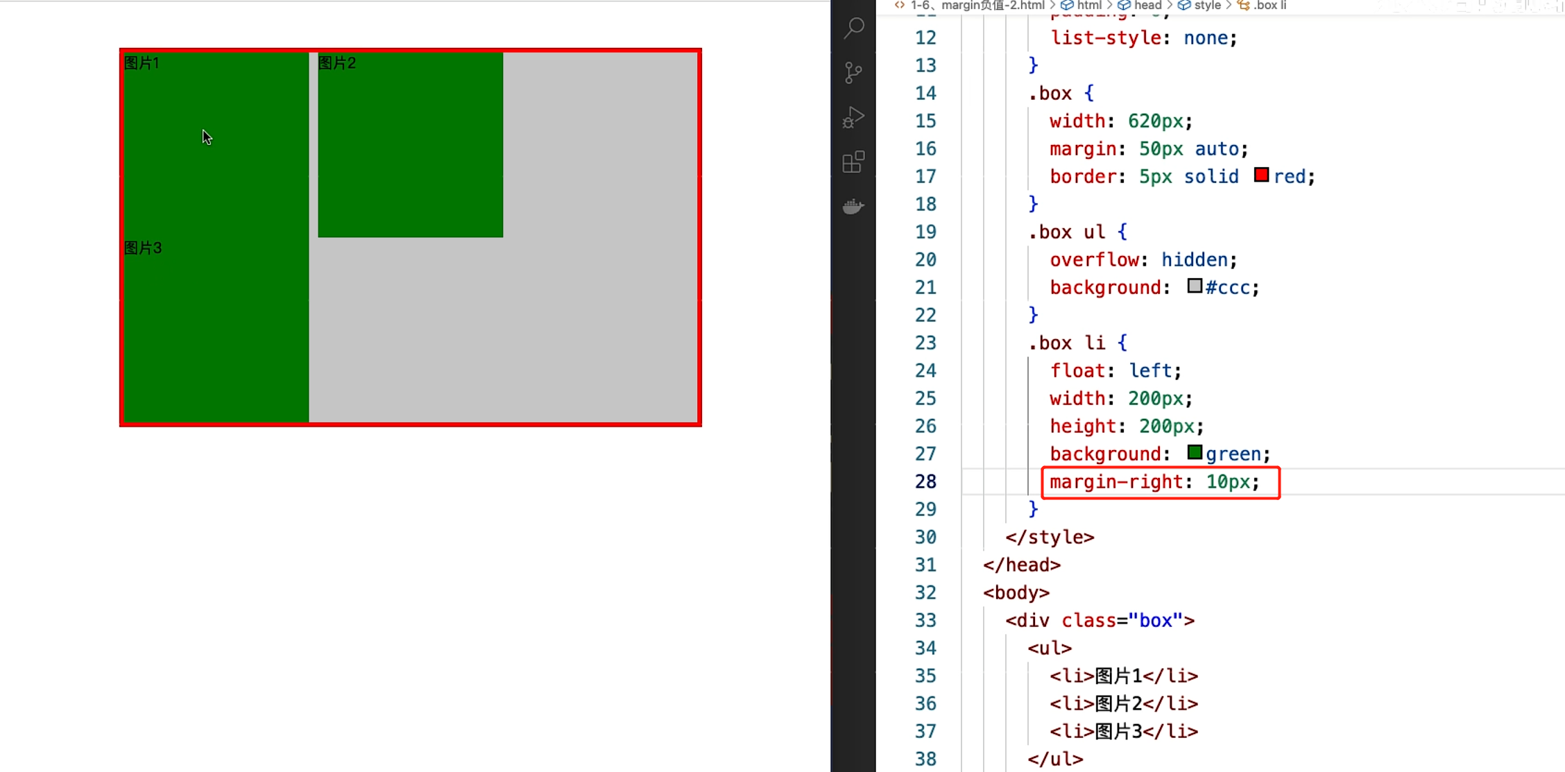
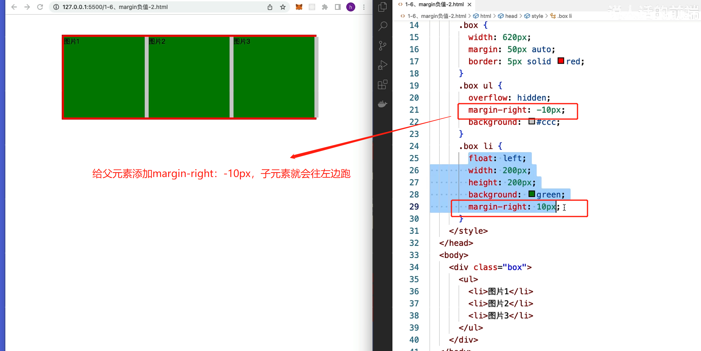
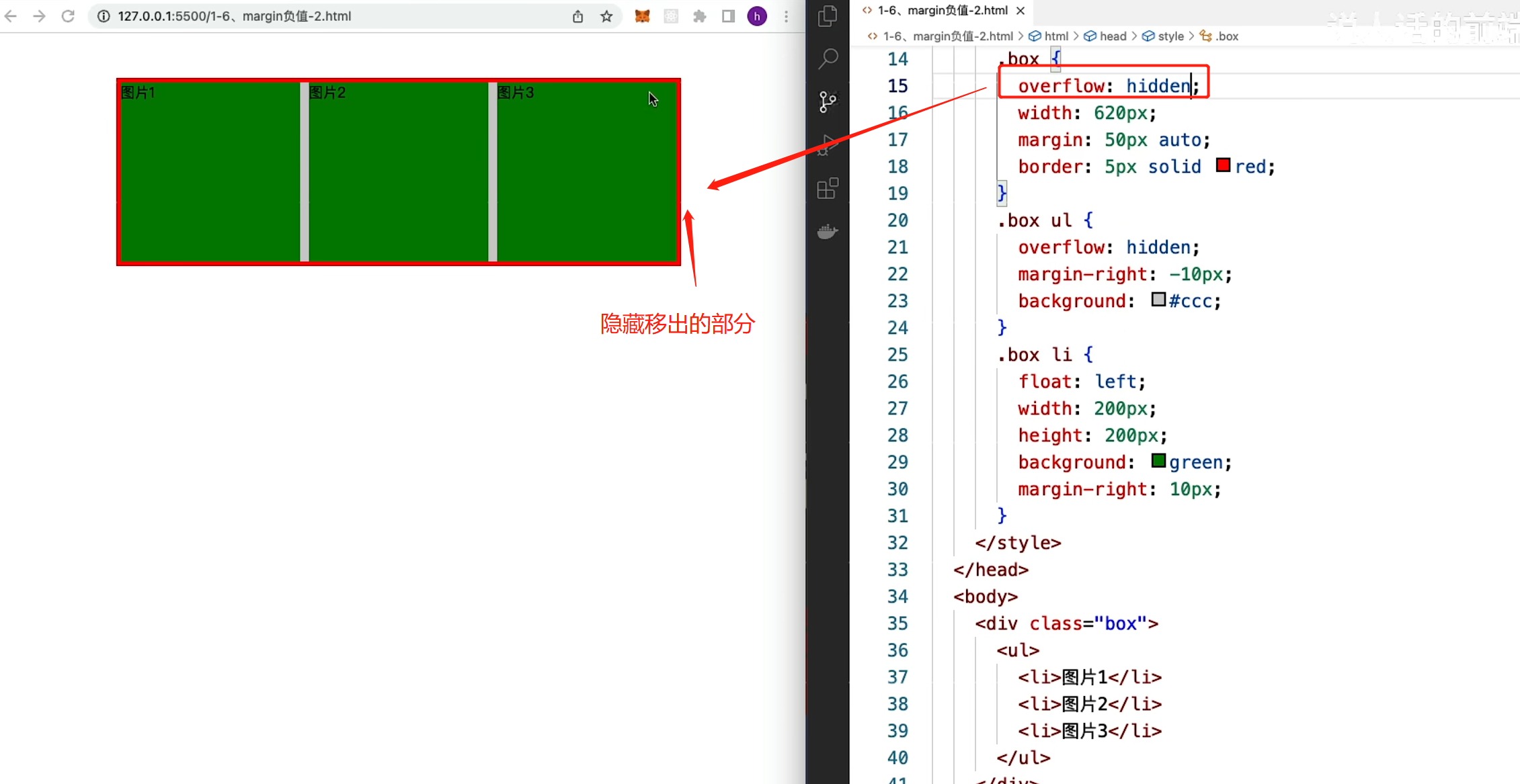
5. margin设置负值后,会怎么样?有何应用?
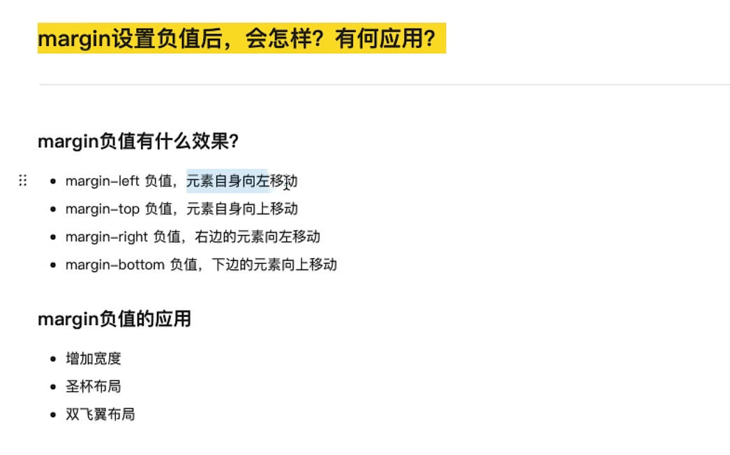
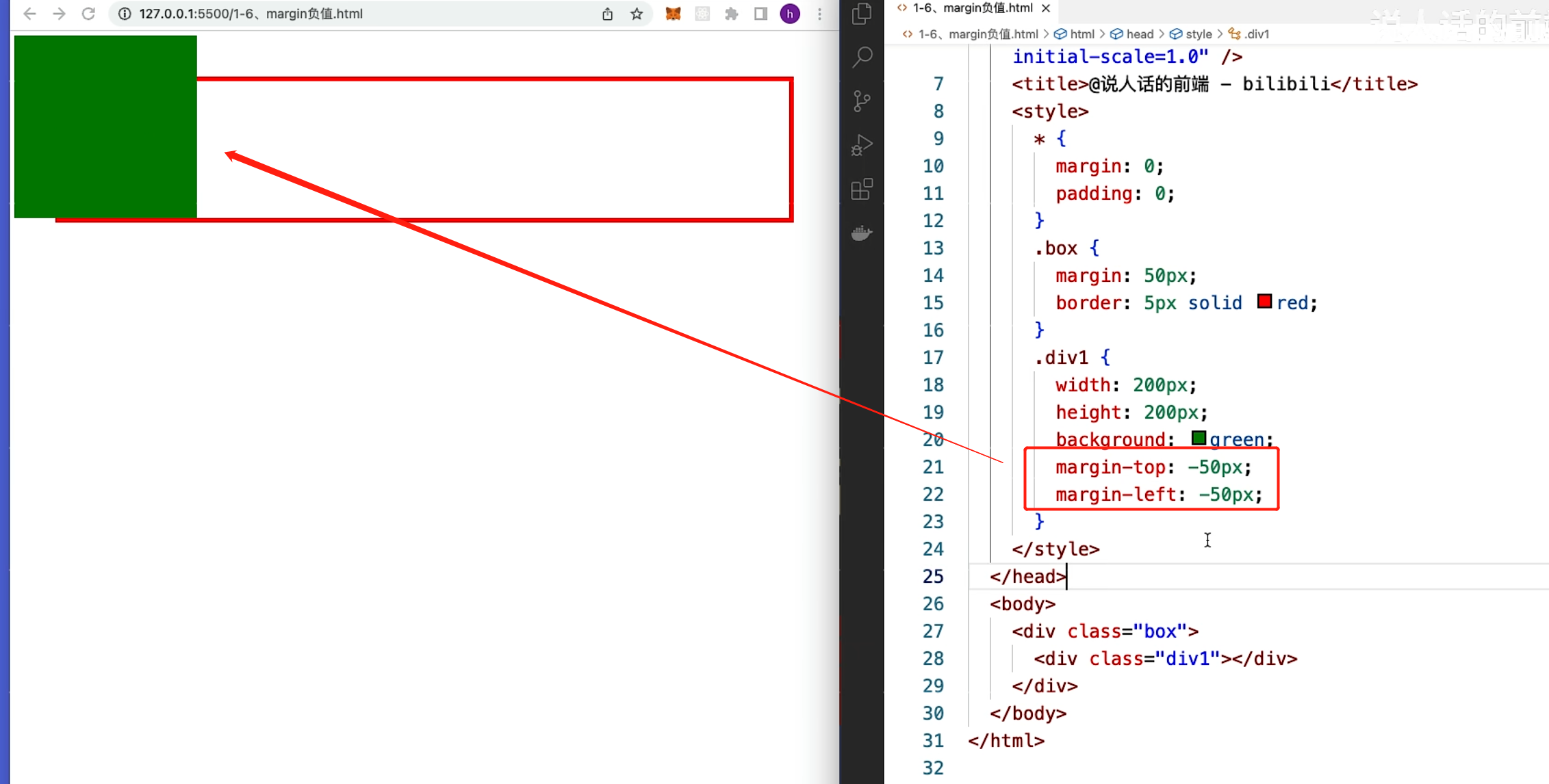
margin-bottom 下边的元素往上跑
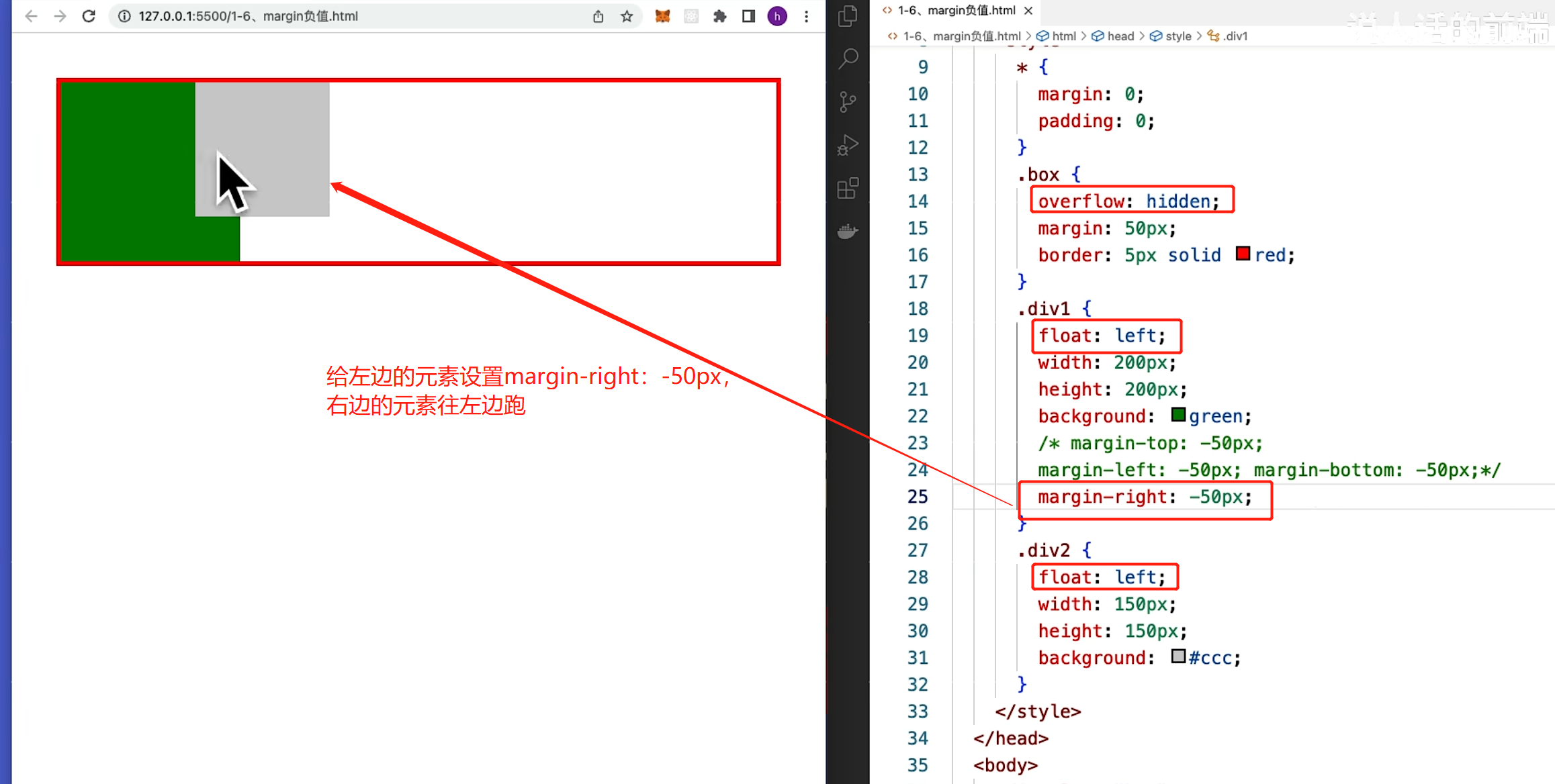
1.margin负值的应用(给父元素添加宽度)
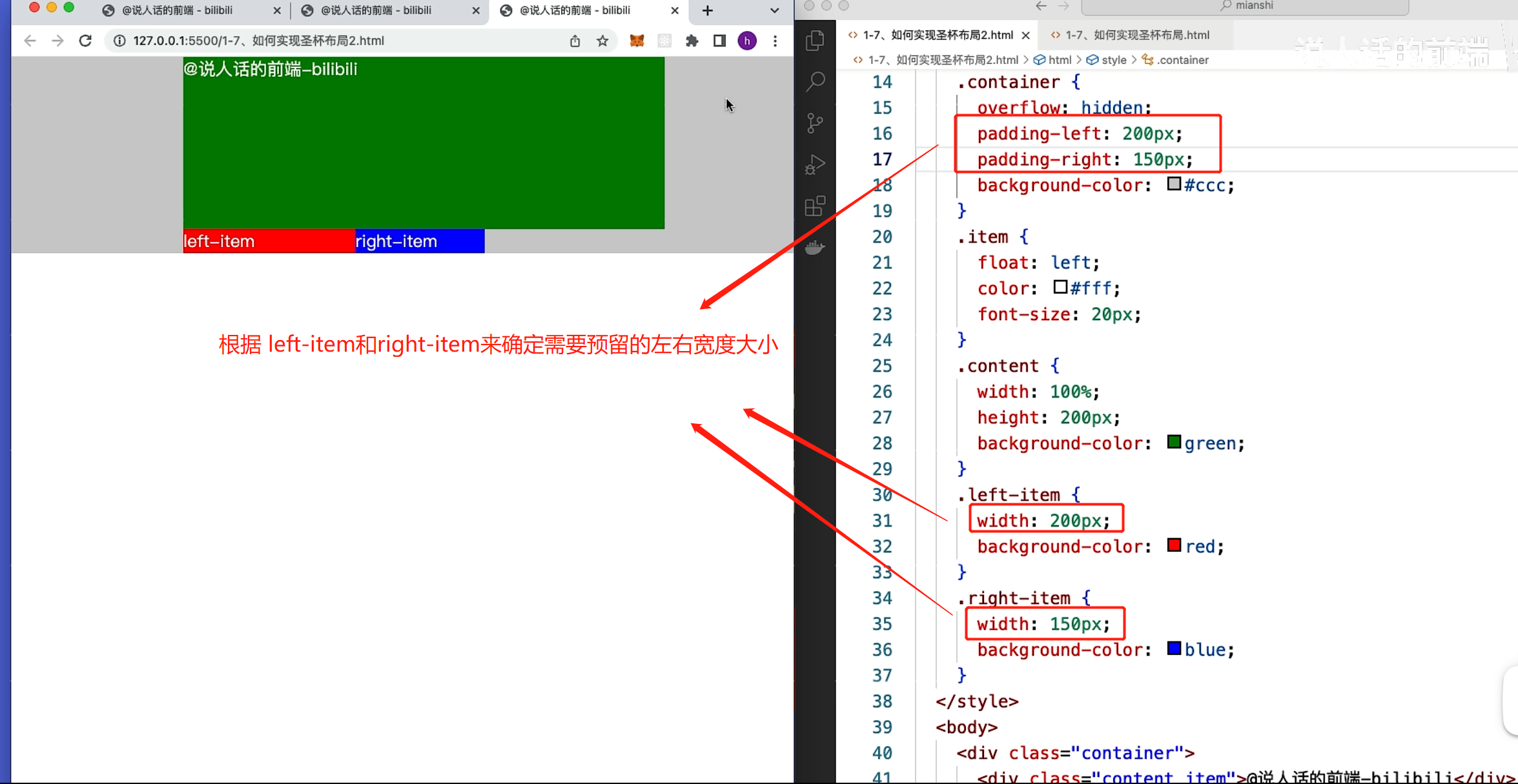
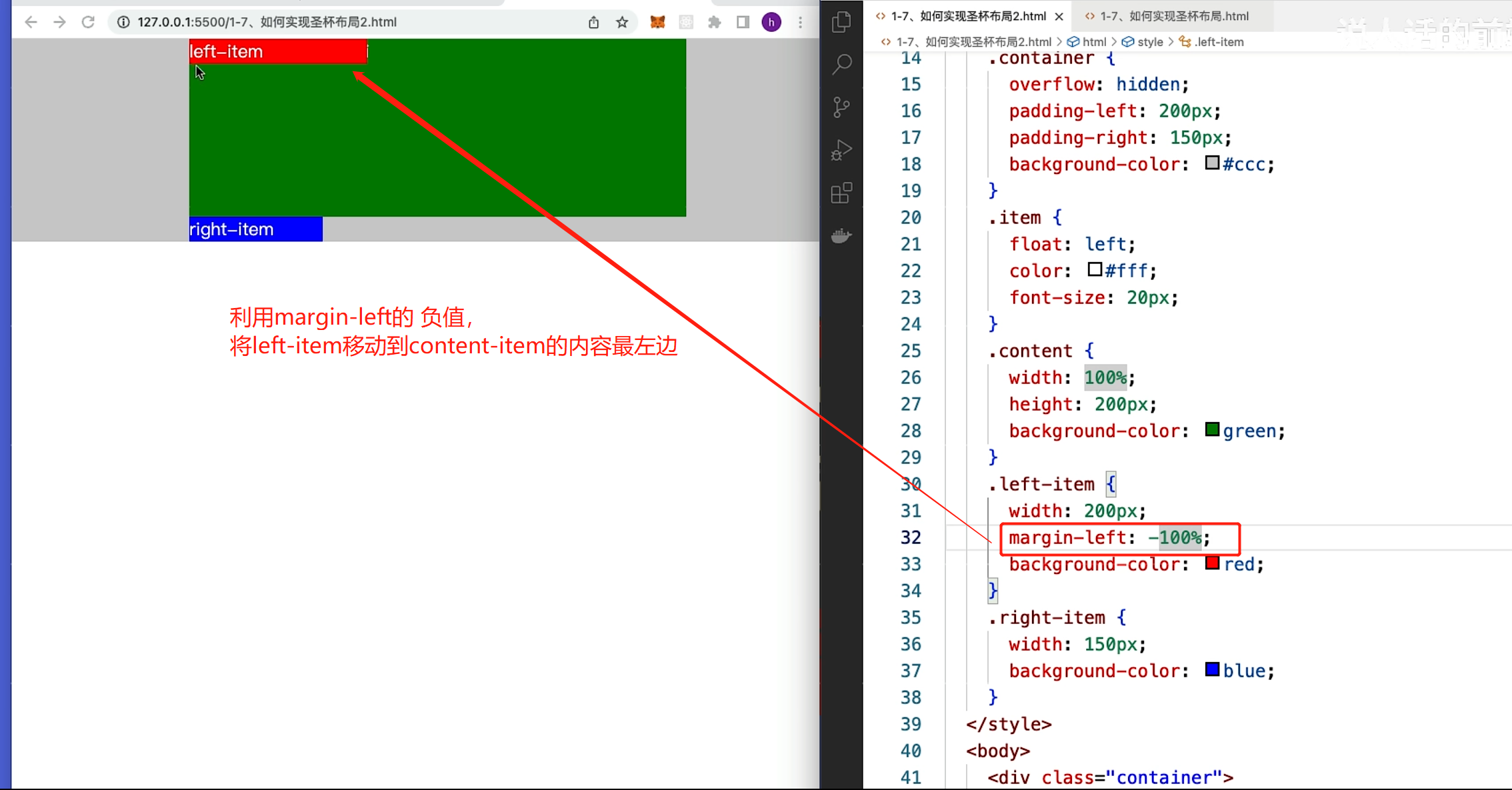
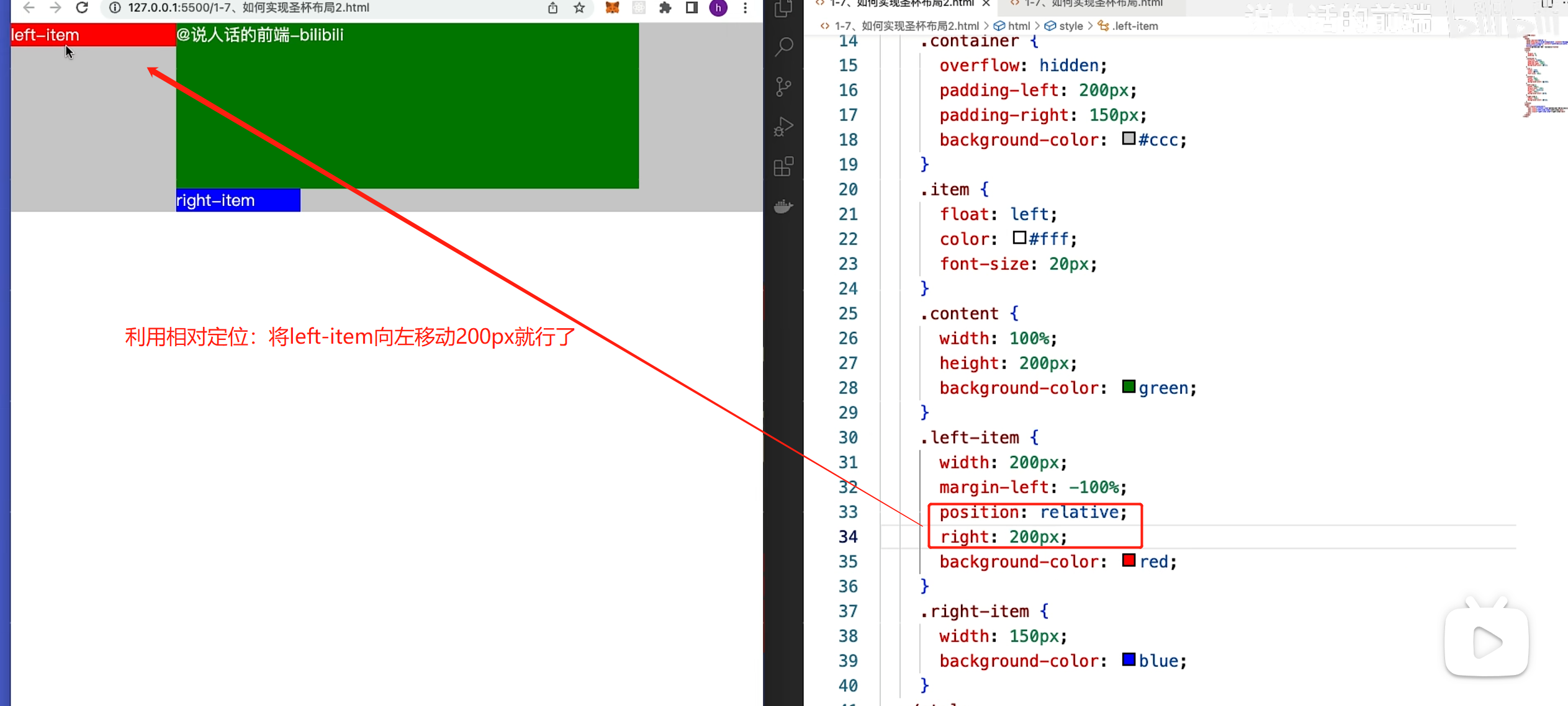
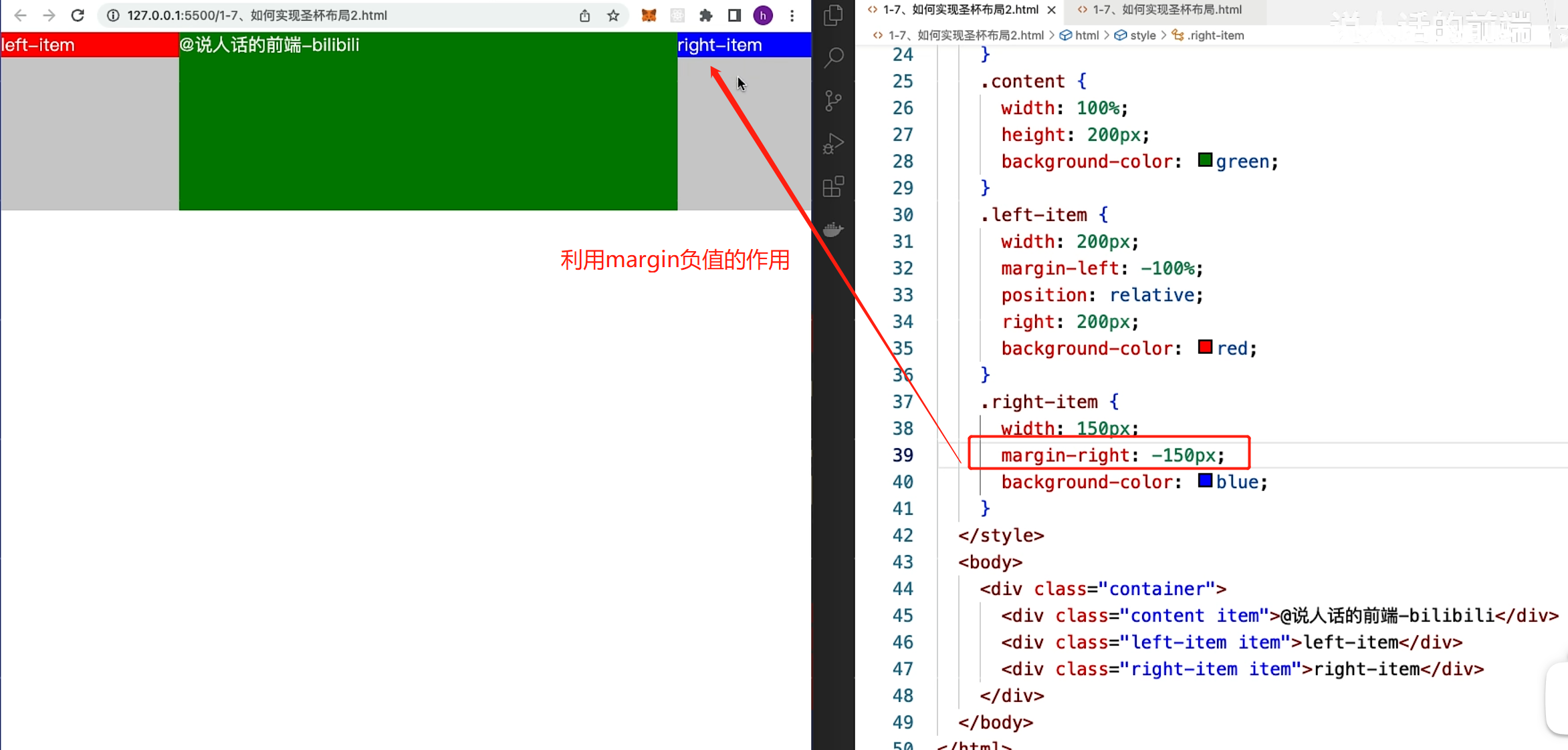
6.如何实现圣杯布局?
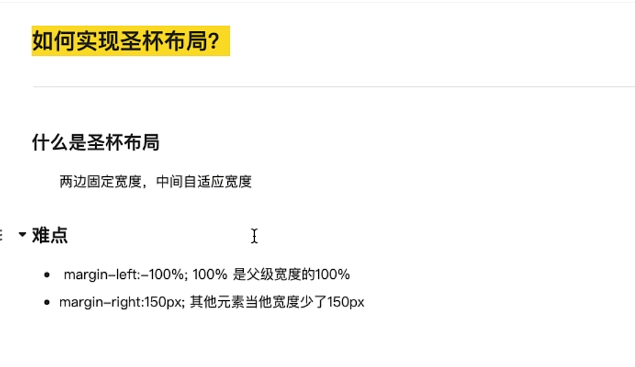
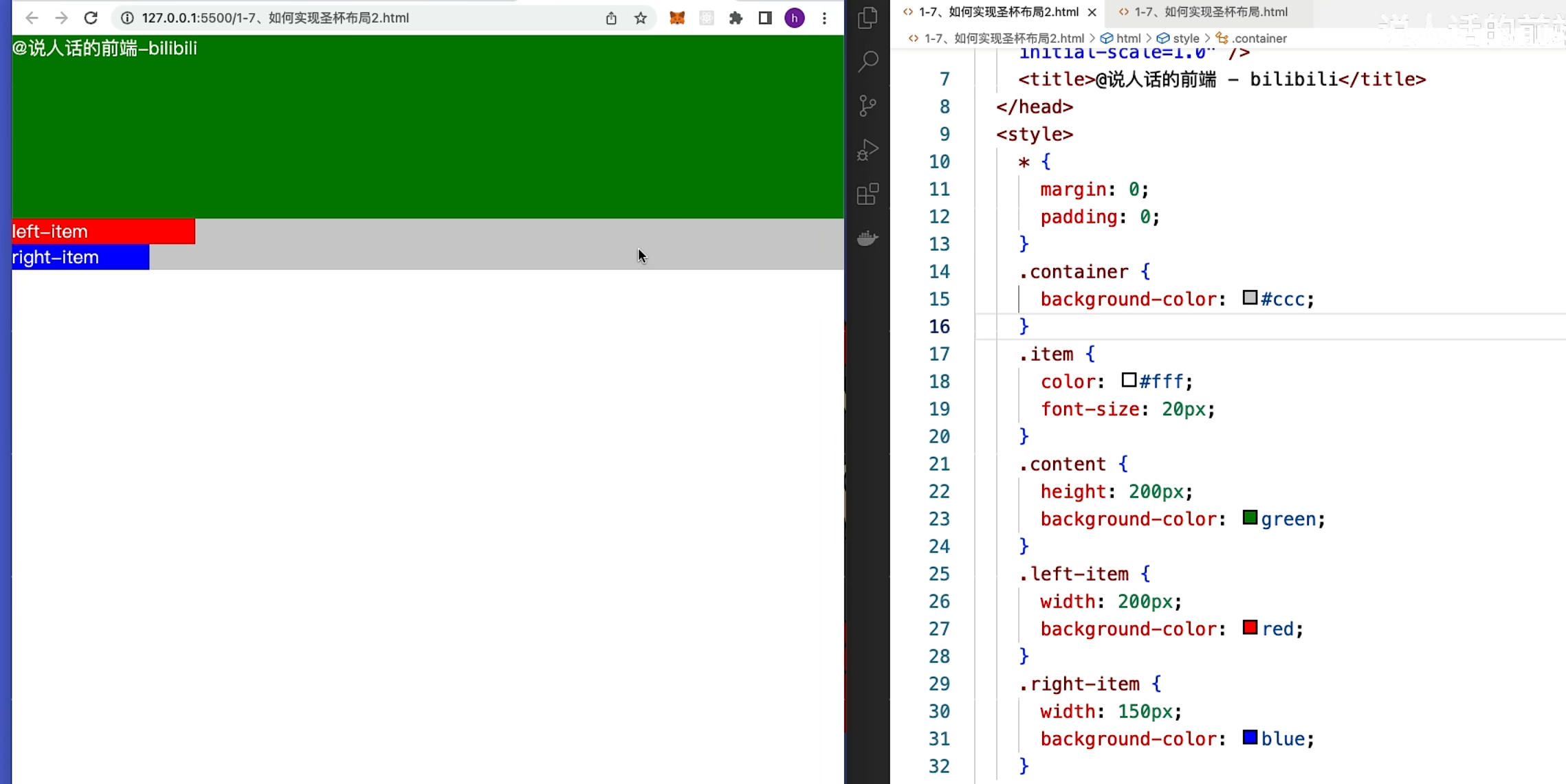
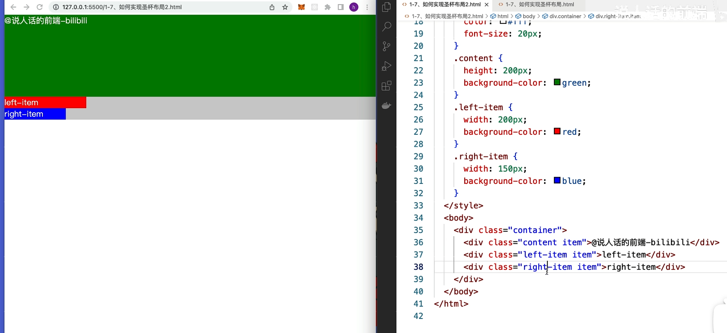
想要实现圣杯布局,第一步是要将 元素排列在同一行上面
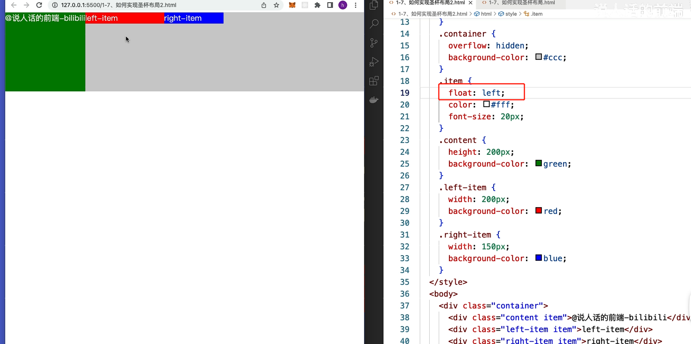
第二步:实现中间内容宽度的自适应
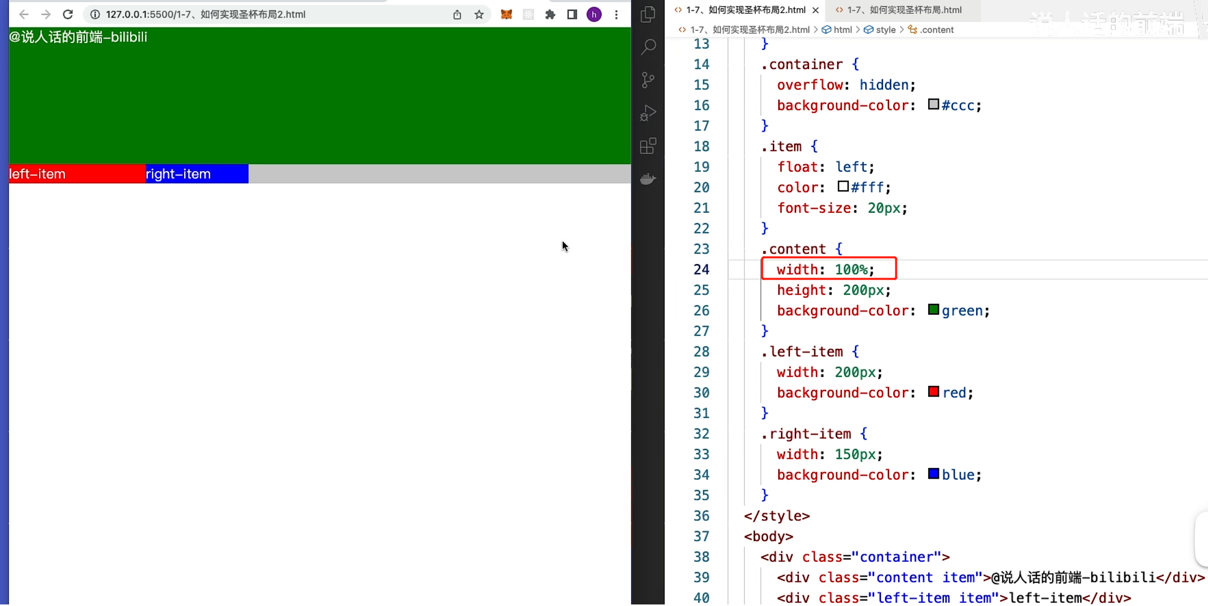
第三步:提前预留 左右的宽度
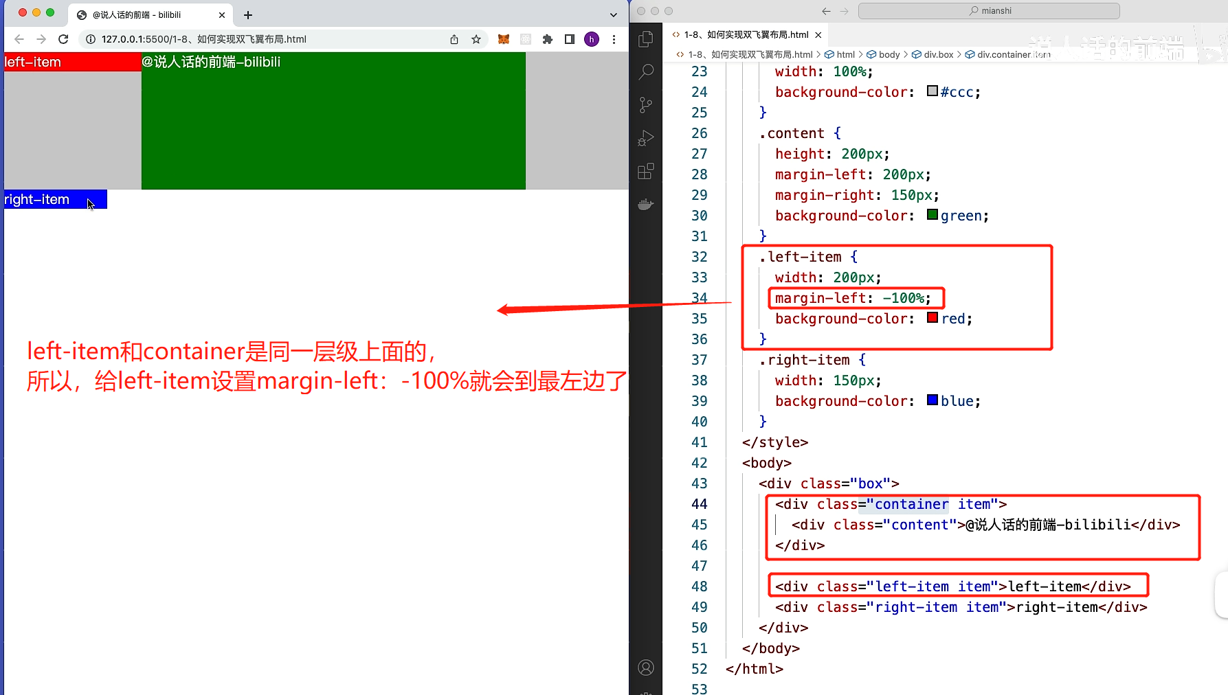
第四步:将left-item 移动到最左边
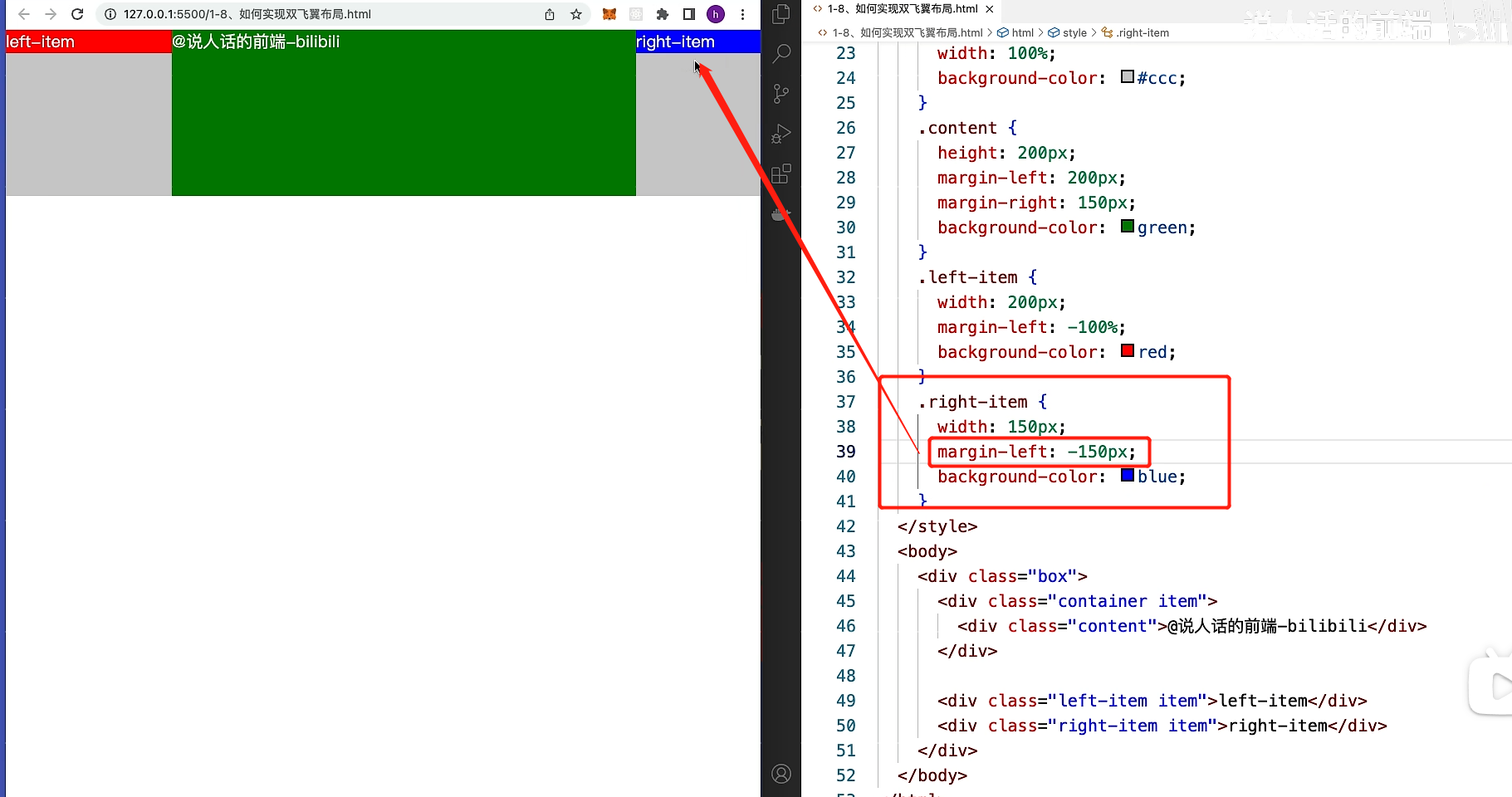
第五步:将right-item 移动到最右边
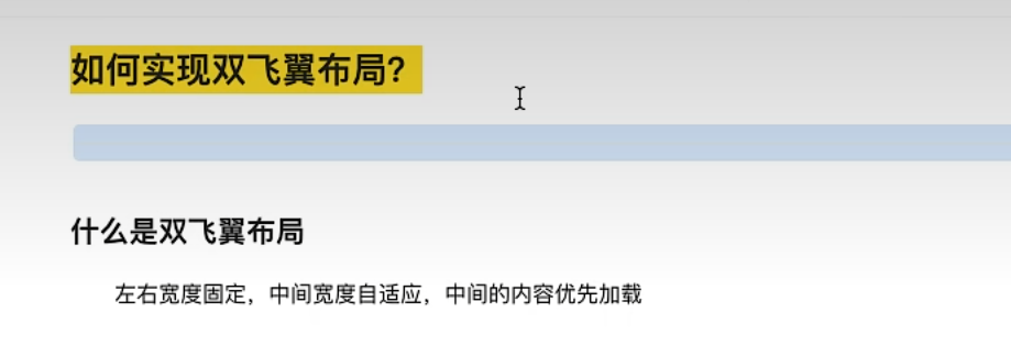
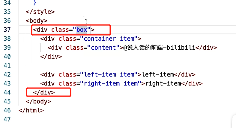
7.如何实现双飞翼布局?
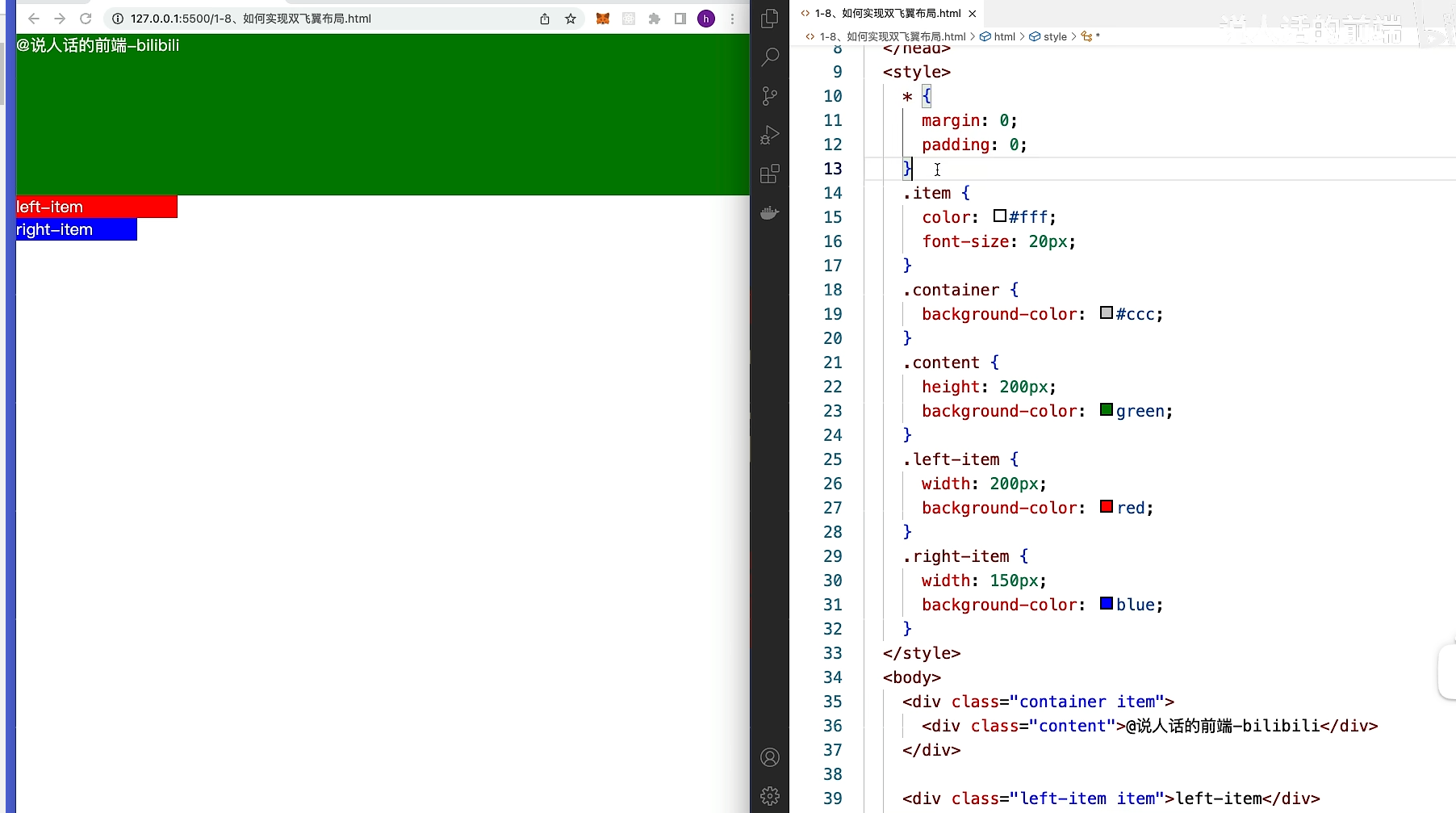
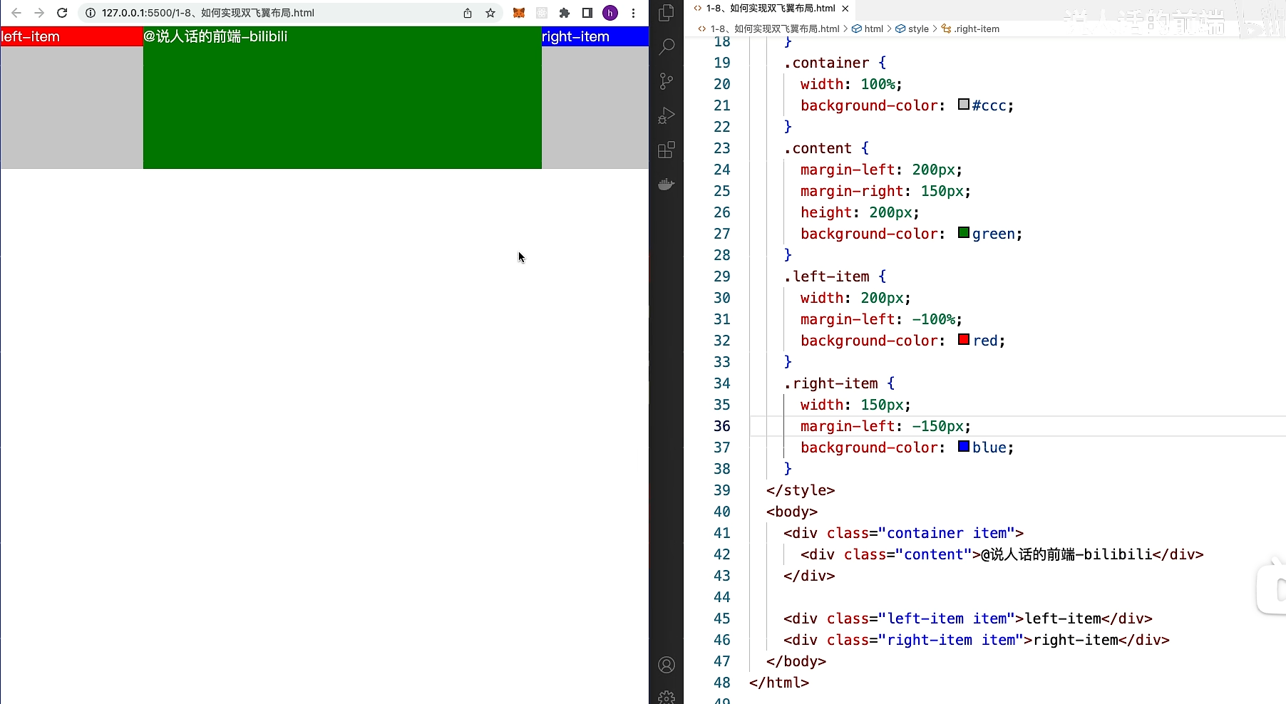
圣杯布局和双飞翼布局 不同点在于:**html的结构不一样**
第一步:设置元素在同一行上面,并让内容的宽度自适应
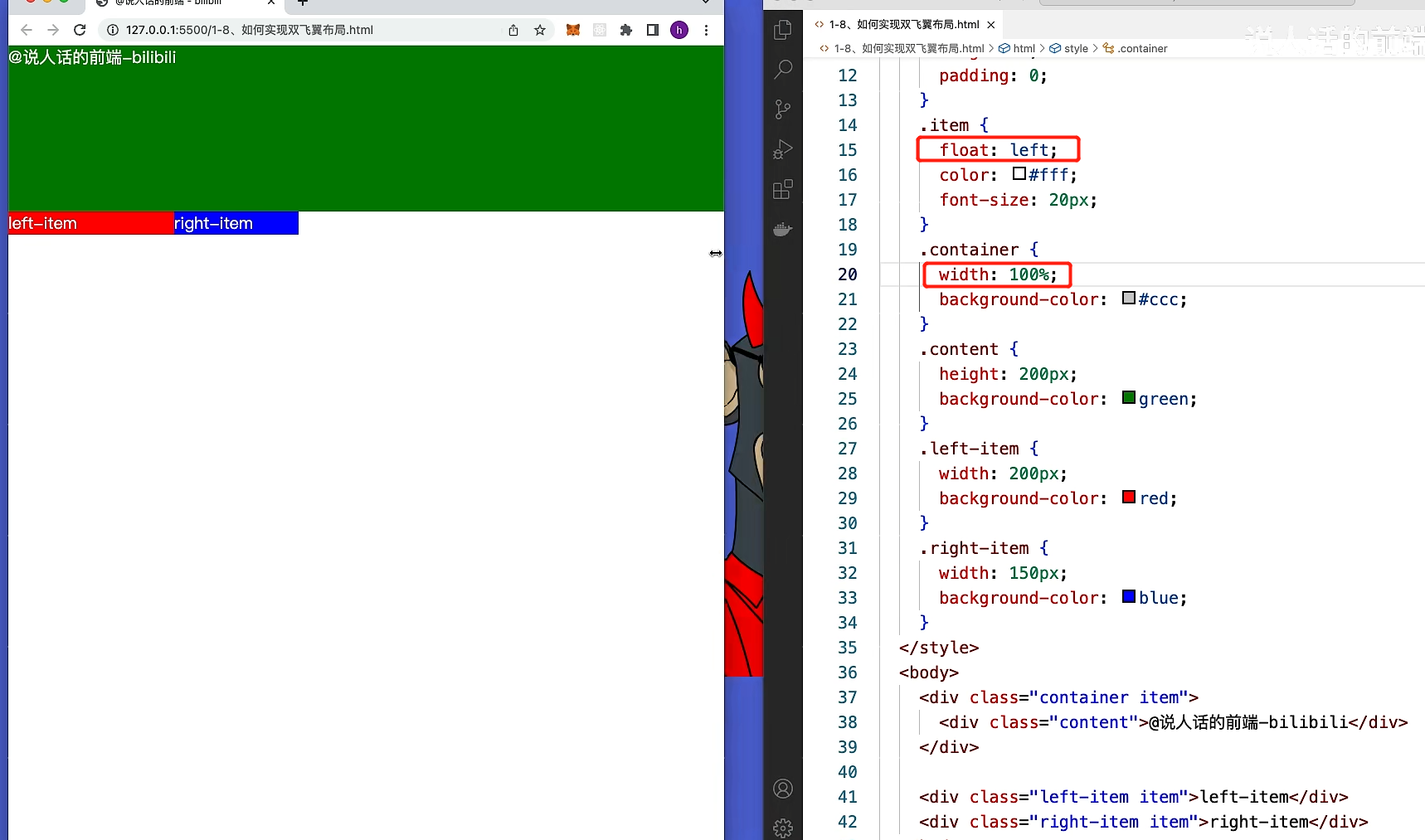
第二步:清除浮动的影响,
添加一个div包起来
添加清除浮动的代码
第三步:左右预留空间
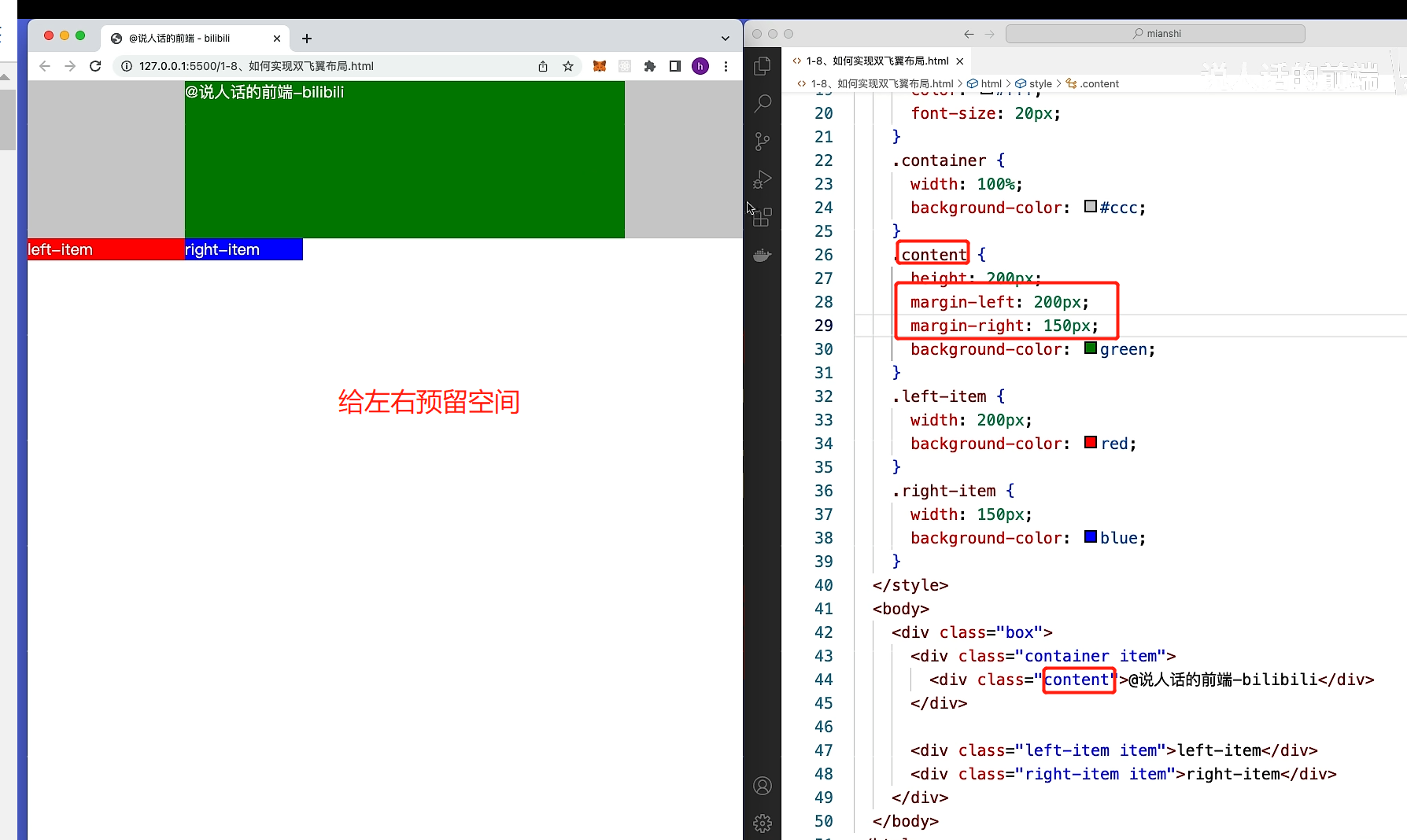
第四步:left-item移动到最左边
第五步:right-item移动到最右边
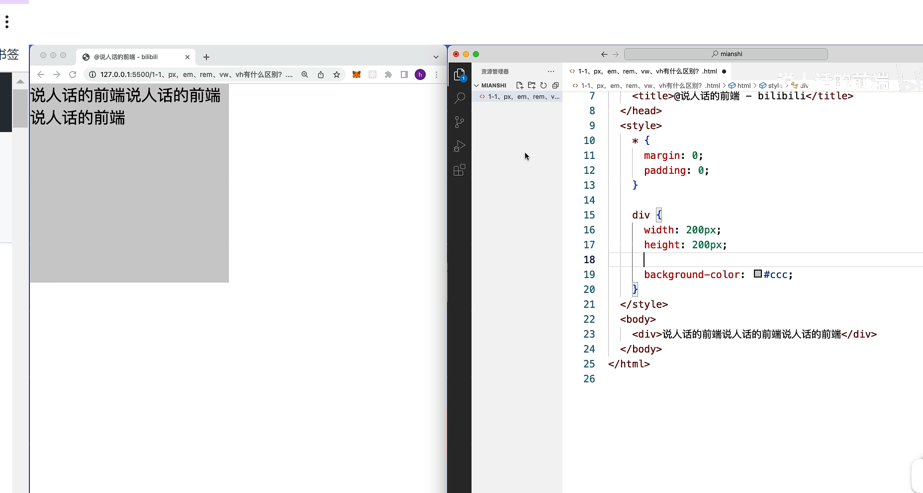
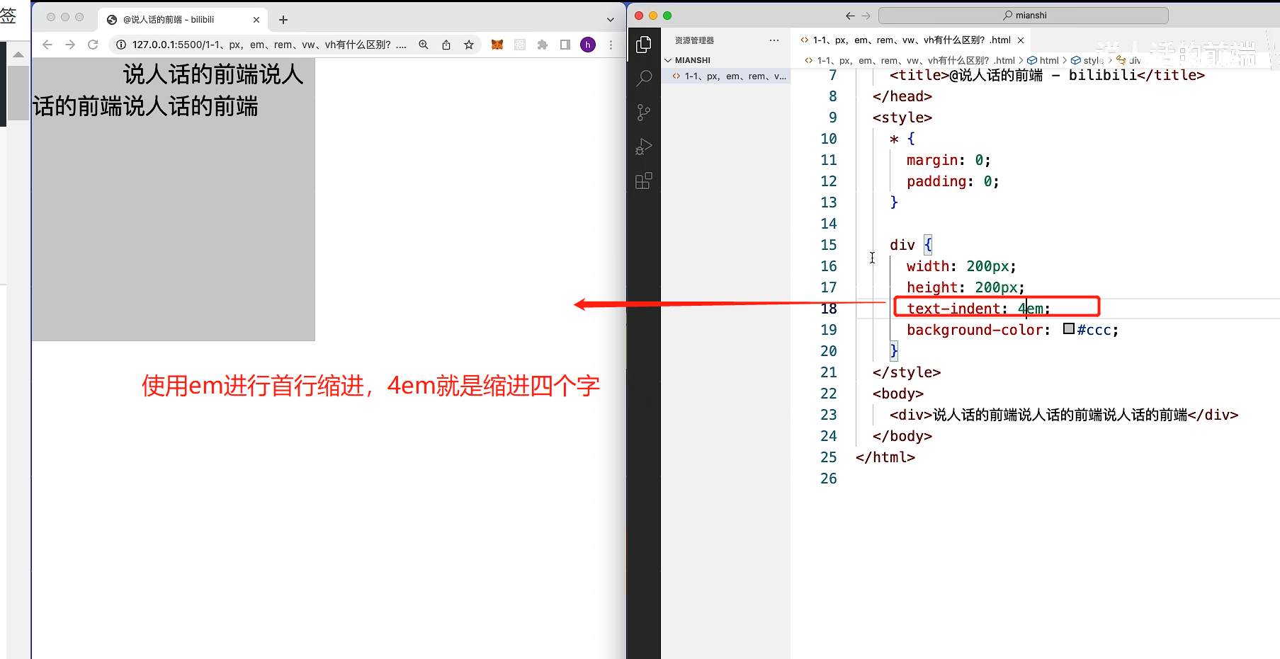
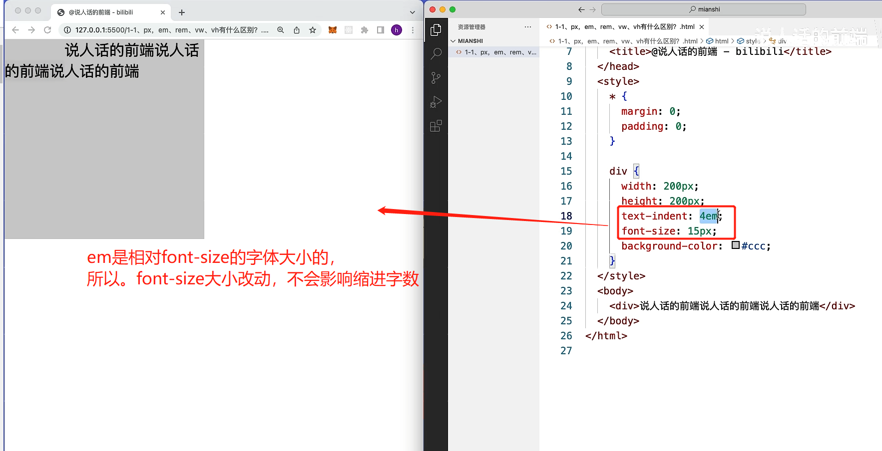
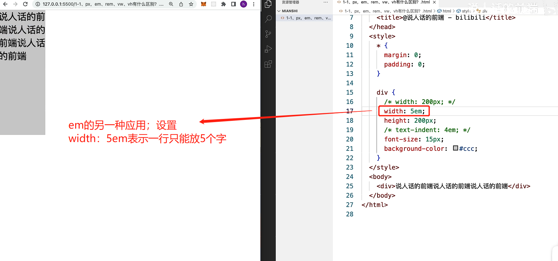
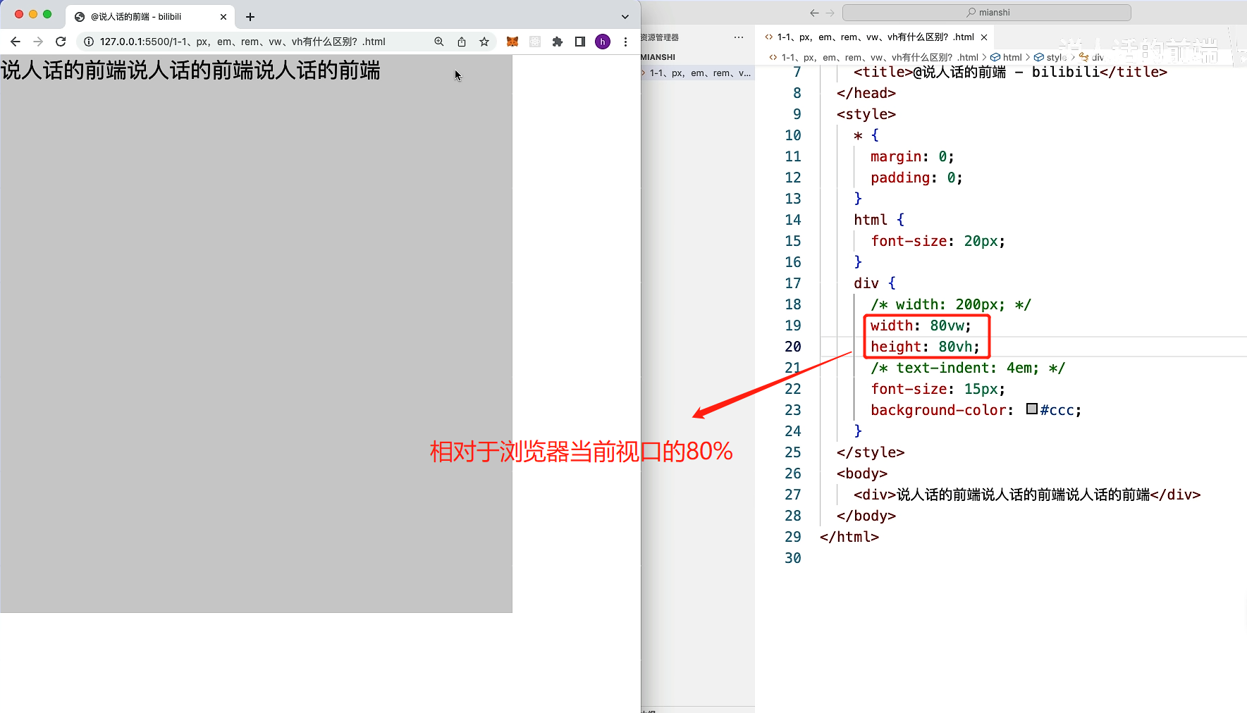
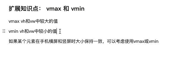
8.px,em,rem ,vh,vw有什么区别?
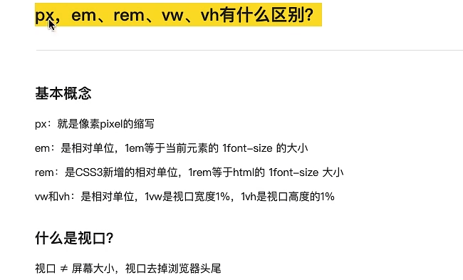
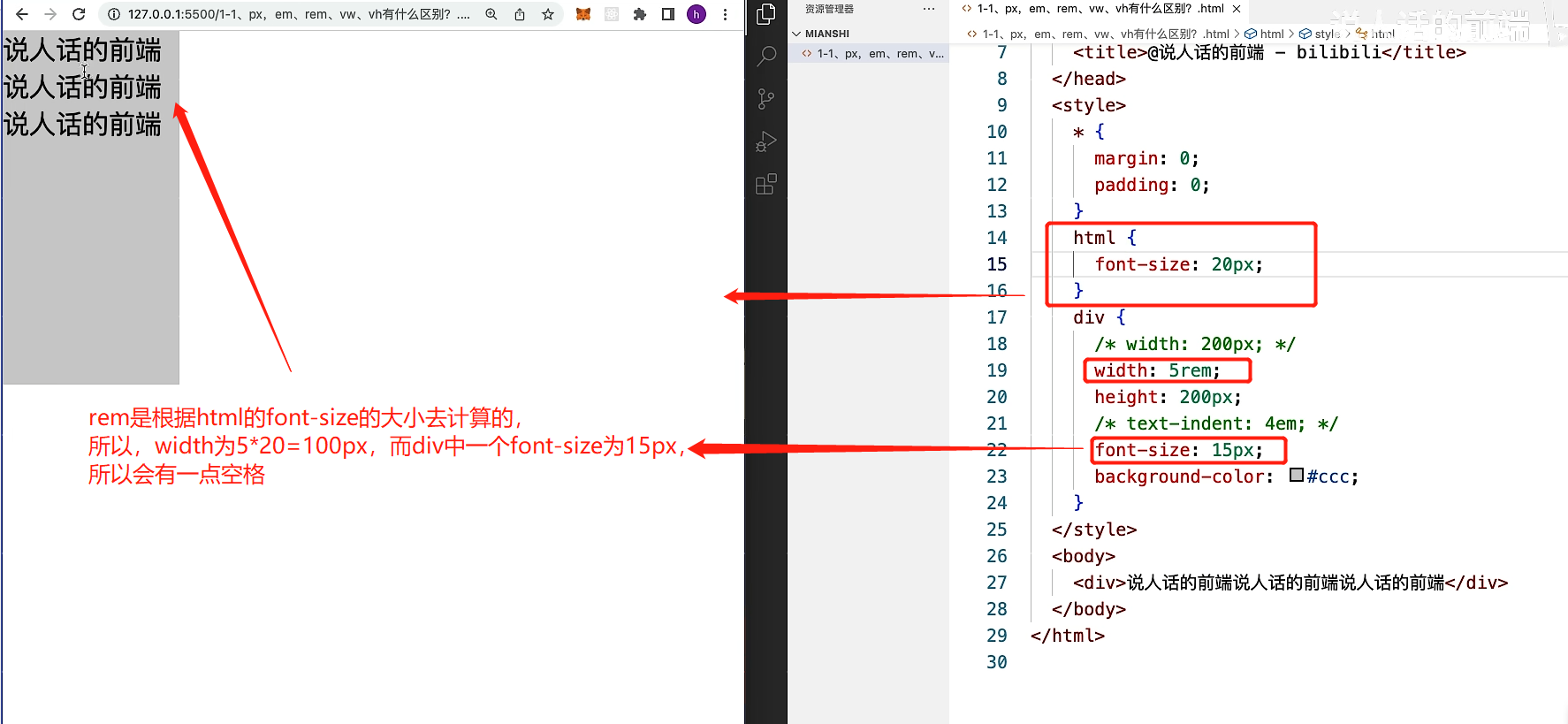
rem通常用在移动端,通过媒体查询等,进行移动端的适配
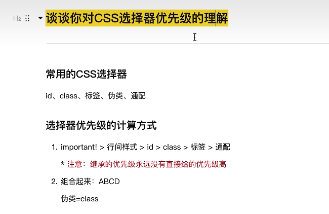
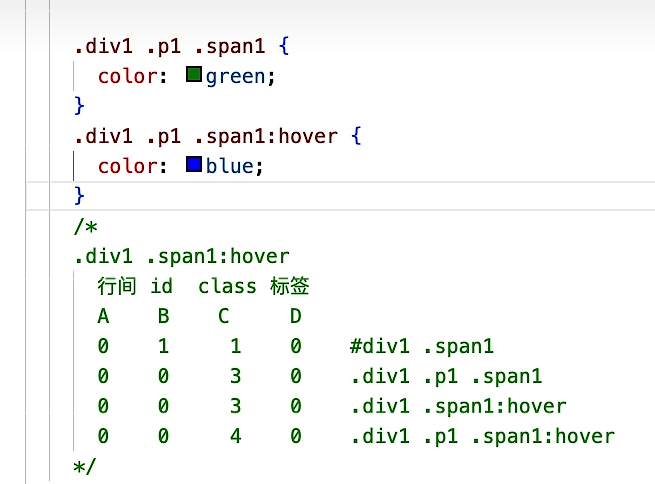
9.谈谈你对css选择器优先级的理解?
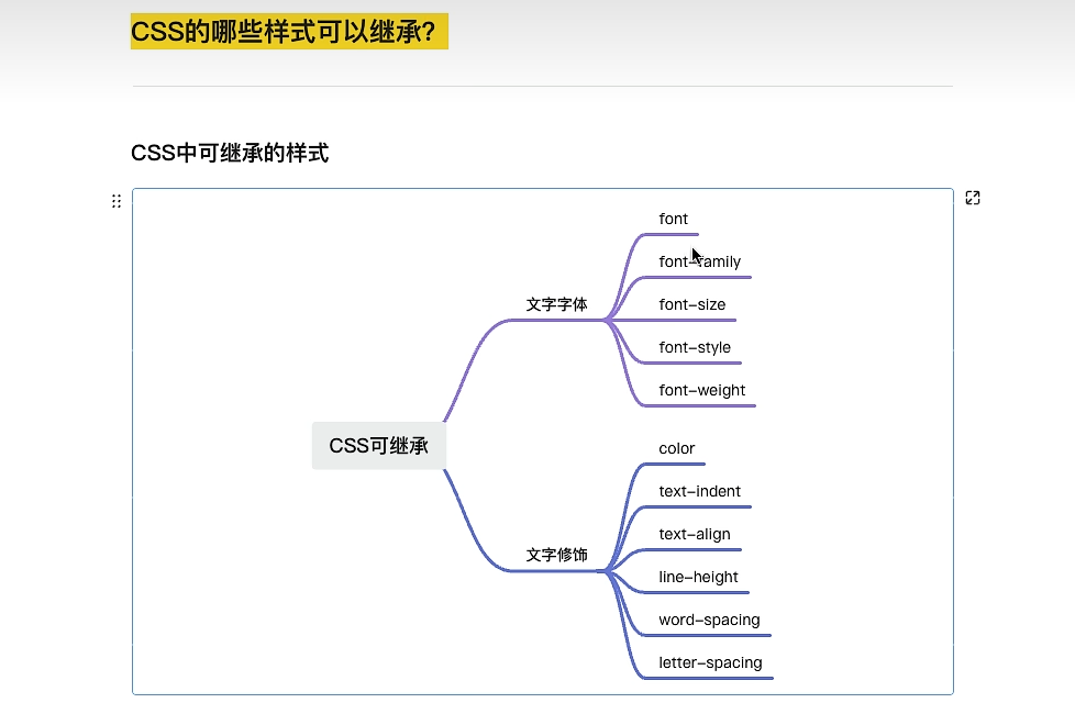
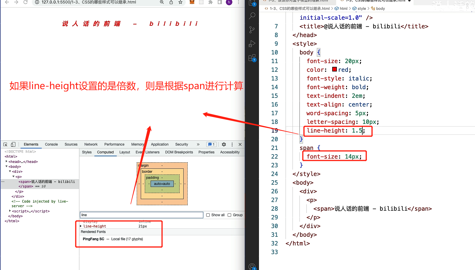
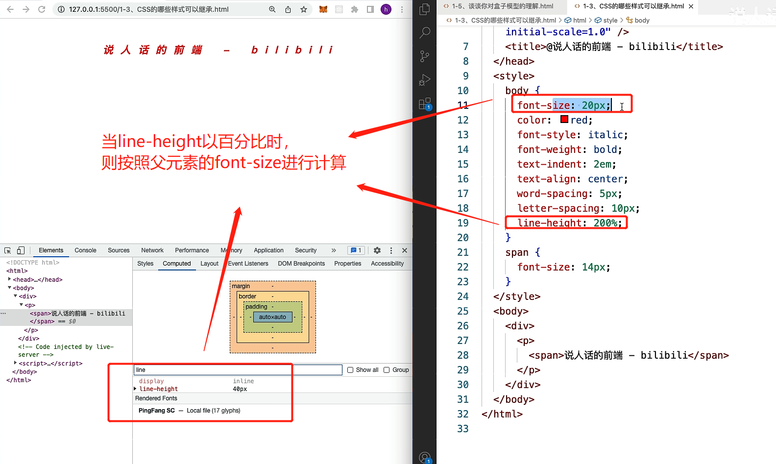
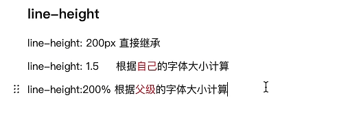
10.css的哪些样式是可以继承的?
本博客所有文章除特别声明外,均采用 CC BY-NC-SA 4.0 许可协议。转载请注明来自 墨苒孤!
评论